
Wikipedia:Featured picture candidates/Externsteine pano.jpg
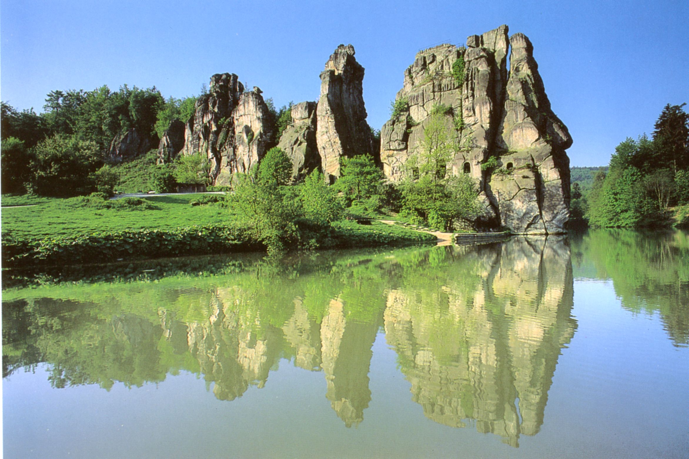
Externsteine[edit]


- Reason
- High resolution photo which does the monument justice plus it is a huge step up from all previous pics of the same subject.
- Articles this image appears in
- Externsteine
- Creator
- User:Dschwen
- Support as nominator — Dschwen 18:58, 30 April 2007 (UTC)
Weak support.I like the image, but I wish there weren't so many people in there detracting from the beauty of the shot. └Jared┘┌talk┐ 20:48, 30 April 2007 (UTC)
- Full support. I have changed my vote to full support. After some contemplating, and seeing others' comments, I see that the people are actually an interesting part of the picture, and I don't think a picture should fail FPC because of the people that are in it. It's a bad precedent for me to follow. └Jared┘┌talk┐ 11:14, 2 May 2007 (UTC)
- Weak oppose. Yes, yes, technically good, etc etc. However, I don't just find the people distracting, I also find the positioning questionable. Why not go forwards to the edge of that sandy path and shoot it with a wide angle lens? Far more impact. --Vaelta 21:55, 30 April 2007 (UTC)
- Because I was not aiming for a cheap sensationalist shot and because a wide angle lens would cause unnecessary distortions. And geez not that people argument again. If I had sopped them out / composed them away, anybody who knew that place would wonder if a neutron bomb had been dropped or why the hell else with a weather like that there were no people. --Dschwen 22:15, 30 April 2007 (UTC)
- I obviously have rather a lot to learn about Wikipedia's "featured" pictures. Should they not be sensational by definition? This picture is informative, yes: it shows some of the rocks and the fact that it is a popular site for visitors. However, do I find this shot especially interesting? No. However, as I read for another photograph below, apparently this is not actually a condition for featured pictures, but to me this looks like any old tourist snap. --Vaelta 07:57, 1 May 2007 (UTC)
- Support. While the people are a little distracting, what would you do? Ask them to leave? Though I have to say, the rocks are tilted. :p Iorek85 00:02, 1 May 2007 (UTC)
- Support The people give an accurate portrayal, as does the tilt (it's on a hill from what I can tell…).--HereToHelp 01:09, 1 May 2007 (UTC)
- Support The people in this image give it both a sense of scale and purpose (since they are engaged in enjoying/climbing the subject). I doubt it would be as interesting without them. I have complained about distracting people in other candidates, but it's a judgement call for each image. --Bridgecross 01:38, 1 May 2007 (UTC)
- Support, "the more people, the better" to a certain extent here. I like the naturality of the shot as well. --Phoenix (talk) 03:46, 1 May 2007 (UTC)
- Oppose Other than the high resolution I don't see how this is FP quality. Composition is not particularly interesting (compared to this one or this one for instance). Technically, I find the uneven sky and the shadow in the foreground more distracting than the tourists, but they don't help either. (Btw, to avoid tourists at a touristy site it's usually best to take a picture early in the morning.) ~ trialsanderrors 20:56, 1 May 2007 (UTC)
- So just that I get it straight, a "boring" composition which shows the subject well without distractions is great for a tomato but leads to an oppose for these rocks? --Dschwen 12:02, 3 May 2007 (UTC)
- You should ask someone who actually supported the tomatoes. ~ trialsanderrors 02:32, 5 May 2007 (UTC)
- Yeah, sorry, it wasn't directed specifically at you. Just the usual FPC frustration. The same pic was nominated by someone on the german FPC and severeal comments point out the good composition. This shows how arbitrary some of the votes are... --Dschwen 09:23, 5 May 2007 (UTC)
- Well, there is an obious difference in the scope of the pictures. The tomato picture is a technical representation of an everyday object. The goal is accuracy and high detail. Most landscape pictures represent subjects that are extraordinary, so the picture should convey what makes the scene so extraordinary, which means technical accuracy is a secondary criterion. On the arbitrariness of the process, it's pretty obvious that a whole lot of commenters don't have any expertise in photography or imaging. I also suspect that few click through to the image page or to the full resolution picture, and even fewer look for comparable alternatives. In short, it's the standard problem with Wikipedia decision making that opinions are cheap while research is costly. I stopped nominating images at Commons because the selection process there is essentially a joke. Here we at least still have discussions about the pictures. ~ trialsanderrors 18:35, 6 May 2007 (UTC)
- Yeah, sorry, it wasn't directed specifically at you. Just the usual FPC frustration. The same pic was nominated by someone on the german FPC and severeal comments point out the good composition. This shows how arbitrary some of the votes are... --Dschwen 09:23, 5 May 2007 (UTC)
- You should ask someone who actually supported the tomatoes. ~ trialsanderrors 02:32, 5 May 2007 (UTC)
- So just that I get it straight, a "boring" composition which shows the subject well without distractions is great for a tomato but leads to an oppose for these rocks? --Dschwen 12:02, 3 May 2007 (UTC)
- Oppose - Agree with Trialsanderrors, good quality photo but composition not interesting enough to be featured. Alvesgaspar 21:41, 1 May 2007 (UTC)
- Weak Oppose - Poor composition. <3 bunny 02:15, 2 May 2007 (UTC)
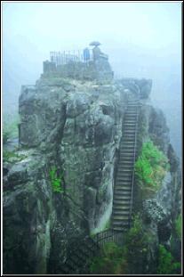
- Poor?! Sorry, but whats poor about the pic? The Person contemplating the rocks in the lower left corner and the slope on the right frame the subject, which fills the frame and is depicted adequately. The foggy detail example quoted by trials is artsy but doesn't tell you much about the rocks, and the other perspective is nice, but the northern rockwall is always in the shadow. --Dschwen 08:51, 2 May 2007 (UTC)
- First of all, I'm sorry I'm voicing my opinion, but there's no reason to flame it. I find the persons in fact do not contemplate a frame, and the sky is definitely not part of the frame. The picture is high resolution, but I find the colours slightly bland, and I'm not sure, but I don't think many of those people you photographed gave you permission to photograph them. Plus, having people defeats the purpose of a landmark photo. <3 bunny 19:45, 2 May 2007 (UTC)
- I'm not flaming, I'm complaining about a rude and unexplained vote. Anyway, thanks for the explanation. One thing though, the permission to be photographed point is completely irrelevant. Under german law (which is where the pic was taken) no permission is necessary if the people are only decoration in a public place. --Dschwen 19:51, 2 May 2007 (UTC)
- First of all, I'm sorry I'm voicing my opinion, but there's no reason to flame it. I find the persons in fact do not contemplate a frame, and the sky is definitely not part of the frame. The picture is high resolution, but I find the colours slightly bland, and I'm not sure, but I don't think many of those people you photographed gave you permission to photograph them. Plus, having people defeats the purpose of a landmark photo. <3 bunny 19:45, 2 May 2007 (UTC)
- Poor?! Sorry, but whats poor about the pic? The Person contemplating the rocks in the lower left corner and the slope on the right frame the subject, which fills the frame and is depicted adequately. The foggy detail example quoted by trials is artsy but doesn't tell you much about the rocks, and the other perspective is nice, but the northern rockwall is always in the shadow. --Dschwen 08:51, 2 May 2007 (UTC)
- Comment I strikes me that this image may have originally been saved in Adobe RGB color space, if you open it up in Photoshop and assign Adobe RGB you'll get a much nicer color. --Fir0002 09:09, 3 May 2007 (UTC)
- It looks turquoise now :-(. My cam saves sRGB and I haven't bothered with proper color management yet. The original looks as I remember it. --Dschwen 10:59, 3 May 2007 (UTC)
- I agree, there is a colour shift and saturation increase in the edit, not just an increase in brightness and it doesn't look as realistic as the original. That said, It does look like it could do with a slight contrast/brightness increase without the colour work in the thumbnail but looks about right when viewed full size. Diliff | (Talk) (Contribs) 09:02, 4 May 2007 (UTC)
- It looks turquoise now :-(. My cam saves sRGB and I haven't bothered with proper color management yet. The original looks as I remember it. --Dschwen 10:59, 3 May 2007 (UTC)
- weak support original/oppose alt - what I don't like about the original is the shaded slope on the right, compositionally it is heavy and distracts from the subject (particularly in the thumnail). I'm not sure there's a crop that can get rid of it though. Debivort 17:19, 3 May 2007 (UTC)
- Support original Good quality; don't like the color of the sky in the second version though. · AndonicO Talk 18:48, 3 May 2007 (UTC)
- Support original. Great quality, but I don't like the sky in the edit. It's a little too intense for my eyes. Next time shove the people down the hill =D Amphy 03:47, 4 May 2007 (UTC)
- Support either image. Great image, technically fine, very encyclopedic. Conor Campbell 17.01, 4 May 2007 (GMT)
- Oppose per trialsanderrors. J Are you green? 01:51, 6 May 2007 (UTC)
- Support original only. Sorry about the late vote; I don't know if it will help or confuse a closer, but I really like the image. The nice sprinkling of people gives needed perspective and scale, the colors look real, the rocks look impressive, and it makes me want to know more about the subject. In fact, I read the article, and if I could think of any german history resources, I'd be contributing to it to make it better, because an article with a picture that nice should be a better article. This picture does what a featured picture should; it wows me, makes me want to know more about the subject, and is an essential contribution to the article.Enuja 00:37, 12 May 2007 (UTC)
- Oppose I have to agree with trialsanderrors. Wikipediarules2221 21:56, 12 May 2007 (UTC)
Not promoted Image:Externsteine pano.jpg --The Sunshine Man 15:32, 8 May 2007 (UTC)
9 supports, 3 opposes, 2 weak opposes *0.5?. Anyway I unclosed this one as well. The closer Sunshine Man apparently is an unexperienced FPC contributor and his other closings were disputed too. This one is looks like a pro consensus to me.— Preceding unsigned comment added by Dschwen (talk • contribs)
- Make it 9 1/2 support votes ! - Alvesgaspar 08:50, 11 May 2007 (UTC)
- Agree. Perhaps move it to more input needed?--HereToHelp 01:26, 11 May 2007 (UTC)
- Its closing time and the vertict seems clear to me. --Dschwen 09:04, 11 May 2007 (UTC)
Promoted Image:Externsteine pano.jpg --Debivort 00:36, 13 May 2007 (UTC)