
Wikipedia:Graphics Lab/Photography workshop/Archive/Jun 2013
Stale[edit]
Resolved[edit]
Klingon costumer with Bat'leth[edit]
-
 A person in Klingon costume with a bat'leth

Article(s): Bat'leth
Request:
- I would like to ask if this image could be cropped and enlarged to focus on the person with the bat'leth to make the picture clearer for the reader. -- The C of E God Save the Queen! (talk) 11:17, 30 May 2013 (UTC)
Graphist opinion(s):![]() Done Centpacrr (talk) 13:29, 30 May 2013 (UTC)
Done Centpacrr (talk) 13:29, 30 May 2013 (UTC)
- Suggestion, perhaps as the "Bat'leth" is the focus of the article where the image is being used it might be good to add a heavy dose of focus_blur/lens_blur (or whatever) to downplay the background so the weapon and figure stand out more. I may give it a go later if no one else has. --Kevjonesin (talk) 14:36, 30 May 2013 (UTC)
- I have no objection to that. The C of E God Save the Queen! (talk) 15:25, 30 May 2013 (UTC)
- Image adjusted to emphasize armed foreground figure. Centpacrr (talk) 18:52, 30 May 2013 (UTC)
- Sweet! : } --Kevjonesin (talk) 19:17, 30 May 2013 (UTC)
- Thanks. The C of E God Save the Queen! (talk) 19:28, 30 May 2013 (UTC)
- Sweet! : } --Kevjonesin (talk) 19:17, 30 May 2013 (UTC)
- Image adjusted to emphasize armed foreground figure. Centpacrr (talk) 18:52, 30 May 2013 (UTC)
- I have no objection to that. The C of E God Save the Queen! (talk) 15:25, 30 May 2013 (UTC)
Opened live scallop[edit]

Article(s): Scallop
Request:
- This image contains a lot of valuable info, but it needs rotating a little (so that the scallop hinge line is parallel with the top margin, and it also needs cropping a lot. And perhaps maybe the background could be darkened a little so it is not so intrusive? Although maybe once it is cropped that won't be so much of an issue? Your call. Invertzoo (talk) 22:49, 29 May 2013 (UTC)
Graphist opinion(s):![]() Done Centpacrr (talk) 23:53, 29 May 2013 (UTC)
Done Centpacrr (talk) 23:53, 29 May 2013 (UTC)
- BUT... wait a minute; the ratio of the shell/proportions of the shell now seem to be compressed top to bottom. The shell was rounder on the original image, am I right? Invertzoo (talk) 00:28, 30 May 2013 (UTC)
- That must be an optical illusion as I did not change the size, shape or proportions of the shell at all. I simply digitally cut it out of the original image, replaced the small bit blocked by the thumb with digital image material of the shell taken from immediately adjacent to that area, and then placed the cut out image over a new neutral background of wooden dock decking. However to be sure that there was no inadvertent change to the shell I have just checked by putting the new image at 50% opacity over the original image and the two shells match exactly. Centpacrr (talk) 00:51, 30 May 2013 (UTC)
- Nice work Centpacrr. The shadow of the scallop on the decking works well. --Kevjonesin (talk) 09:48, 30 May 2013 (UTC)
- Sorry to put you guys through so much work, and I apologize for thinking the ratio had been changed. That was my error, and of course I should have checked it with a ruler before I said anything. Sorry, sorry sorry. Anyway, it is a really great picture now and will be fantastically useful as well as being so much nicer-looking than the original! Invertzoo (talk) 12:59, 30 May 2013 (UTC)
Collaborative remix[edit]
After comparing both Nagual and Centpaccrr's versions, with each other and the original image, it seemed to me (IMHO) that Nagual's came off a bit 'overstated' (slightly caricatured) while Centpaccrr's could be seen as slightly 'understated' (a touch 'washed out'). In the spirit of Goldilocks and her ursine acquaintances I went for something in between by layering a (23%) transparency of Nagual's over Centpacrr's. Also removed some white artifacts (mostly from the decking). I then uploaded with minimal compression settings to defer compounding of .jpg losses.
At present, in the spirit of wiki, it's a three way collaboration. Well, four if you count the original photographer, hmm..., five if one counts Invertzoo, err..., six if you include the scallop... ad infinitum... : }
Of course Invertzoo — for whom we toil, >wink< — if you have a preference for a different version feel free to say so — or simply click 'revert' in "file history" to make the change. --Kevjonesin (talk) 11:20, 30 May 2013 (UTC)
- Sorry to put you guys through so much work, and I apologize for thinking the ratio had been changed. That was my error, and of course I should have checked it with a ruler before I said anything. Sorry, sorry sorry. Anyway, it is a really great picture now and will be fantastically useful as well as being so much nicer-looking than the original! You guys are great!!! Thanks so much! Invertzoo (talk) 13:01, 30 May 2013 (UTC)
- Sorry, Invertzoo, I had to remove the composited image I created as it is apparently now unacceptable to some others, however as you are the OP of this request you are also the final arbiter as to which one is used so feel free to restore any earlier version if you like one of them better. Centpacrr (talk) 04:46, 31 May 2013 (UTC)
- I have to prefer the neutral background over the wooden decking. It looked pretty, but as with many such "composites", on closer inspection it can be problematic. The decking appears to be 2x4s or 2x6s. The shell appears to be about the size of a coffee saucer. So in combination, either the decking is little 1 inch strips of wood nailed with very tiny nails, or the shell is the size of a large serving platter. It's hard to look encyclopedic with egg on our face. Actually, I would even go as far as to say leave the original image alone as it gives the reader a sense of scale. – JBarta (talk) 07:27, 31 May 2013 (UTC)
My edit was meant to be tongue-in-cheek and should have simply been reverted. I was trying to make the point that artistic license should be kept to a minimum on Wikipedia. Centpacrr's edit, though pretty, is not what I would call a neutral background. White or gray would be more appropriate IMO. Perhaps I should have made my pastiche more obvious by including some sliced lemons and the words Serving suggestion in the bottom corner? nagualdesign (talk) 00:11, 31 May 2013 (UTC)
- LOLz. So 'caricatured' was accurate. "Serving suggestion" >chuckle< : }
- [Further thoughts: please see talk page...]
- --Kevjonesin (talk) 02:44, 31 May 2013 (UTC)
Other options[edit]
Invertzoo, since it seemed to me that the image was being used in the article to provide a 'real world' example alongside the File:Scallop Diagram2.svg info graphic I added some 'flipped' and/or rotated options (see below) which may make it easier for readers to correlate with the graphic.
-

-
 Opened scallop shell (3).jpg: 180 rotation w/ colored texture background, no hand.
.jpg)
.jpg)
Invertzoo, Is the left/right orientation of Opened_scallop_shell_(new-flipped-w-darkened-bkgrnd).jpg correct? If so I can easily horizontal flip Opened_scallop_shell_(3).jpg to match as well.
p.s. Was simply joking about "toil" earlier. I enjoy image editing. Editors on the other hand... >double-wink<
: }
--Kevjonesin (talk) 17:02, 31 May 2013 (UTC)
- The upside-down images look unnatural, but I take your point about the diagram above it in the article. Perhaps someone could make a request at the Illustration Workshop for a 180° rotated derivative of File:Scallop Diagram2.svg? nagualdesign (talk) 22:45, 31 May 2013 (UTC)
- The version of the image that has again been flipped left-for-right is absolutely unusable as it is misleading, unencyclopedic, does not match the illustration above it, and completely misrepresents the true anatomy of the organism. This is the same thing as flipping an illustration of the anatomy of a human left for right which, as you can see here, could never be used on WP or anywhere else. Centpacrr (talk) 00:07, 1 June 2013 (UTC)
- I totally agree about the anatomical point. I assumed that if the diagram was simply rotated (no flipping) it would match up with the photograph (in its original orientation). If the result is a diagram that's a mirror image of the photograph then perhaps something is already amiss? nagualdesign (talk) 00:21, 1 June 2013 (UTC)
I am just amazed by the virtuosity of you people here in the Photography workshop; thanks so much for all of these options!!! Centpacrr is correct that we must not flip the image... that is, assuming it was not flipped before it was uploaded. I do not yet know if the diagram is accurate in its left-right orientation; I will try to look up some reliable source diagrams and /or pictures and try to learn a bit more about the anatomy so I can be sure what is correct. Of course a scallop has a right valve and a left valve, and for those scallops where the two valves are equally "dished" in shape, it might be true that where exactly you cut the adductor muscle (close to one valve or close to the other) determines on which valve most of the anatomical organs end up. That might be true. In any case, I do think it is probably useful to have one version of the picture that is rotated 180 degrees. As for which are the best images out of this big buffet of fabulous stuff, I need to look at them all tomorrow when I am more rested, having just got back from working at the museum. Thanks again everyone! Invertzoo (talk) 00:32, 1 June 2013 (UTC)
And come to think of it, it is true that the hand/fingers do give a sense of scale. I also need to try to determine which species of scallop this is. Invertzoo (talk) 00:35, 1 June 2013 (UTC)
- Absent proof positive that the original image was flipped left-for-right (a highly dubious contention indeed), the assumption must be that it was not flipped and therefore doing so now is unjustified and unencyclopedic. There is also no indication what specific species or type of scallop (and there are many) that the diagram is meant to represent (if any specific one) which may be completely different than the one in the image. Therefore the unflipped orientation of the image must be assumed to be correct in the absence of compelling proof -- and not mere speculation -- that it is or may not be. Centpacrr (talk) 00:59, 1 June 2013 (UTC)
- Oh pshaw, y'all. Read this: commons:File talk:Opened scallop shell (new-flipped-w-darkened-bkgrnd).jpg#Orientation. The image is not currently being used for anything other than to illustrate a question related to scallop anatomy and an .svg file. Maybe we could give the folks with particular interests in mollusks a chance to respond before
having butthurt conniptions... err... oops, now I'm doing it...mounding the molehills... err.. anyway...
- Oh pshaw, y'all. Read this: commons:File talk:Opened scallop shell (new-flipped-w-darkened-bkgrnd).jpg#Orientation. The image is not currently being used for anything other than to illustrate a question related to scallop anatomy and an .svg file. Maybe we could give the folks with particular interests in mollusks a chance to respond before
- The image is not currently used in any encyclopedia article pages; however, it is being used to inquire about the orientation of scallop anatomy. I suspect leaving it be for a week or two to give Scallop editors a chance to respond won't do any irreparable harm to any of the assorted wiki projects connected to Commons files. If you're really concerned that innocent children may stumble across it in the mean time and be at risk of being misled as to the precise nature of a particular scallop's anatomy — sure to lead to disillusionment, social decay, and 'the Mollusk Defense' entering into legal infamy — then feel free to add comments to the file page warning readers of their peril. Perhaps "breath in, breath out, repeat' before and/or after may prove useful. Or just listen to the mollusk. I'm diggin' it. Or maybe enjoy some light reading? The film's quite fun as well... OK, Ok, ok... I'll clam up now. : } --Kevjonesin (talk) 02:35, 1 June 2013 (UTC)
- Personally, I thought that article use was something best left for Invertzoo* and others actively working on the Scallop article to decide upon. Centpacrr, might I suggest you apply some of your enthusiasm for orthodoxy to splitting File:Opened scallop shell.jpg into separate 'original version' and 'altered version' filenames as per Commons guidelines? --Kevjonesin (talk) 15:01, 1 June 2013 (UTC)
- p.s. — *The fact that this subsection is explicitly addressed to User:Invertzoo might have been a clue along with the included inquiry posted simultaneously with the thumbnails images. Oy vey , ai carumba, mama mia, Doc, Smiley, & Grumpy old tunes...
- p.s. — *The fact that this subsection is explicitly addressed to User:Invertzoo might have been a clue along with the included inquiry posted simultaneously with the thumbnails images. Oy vey , ai carumba, mama mia, Doc, Smiley, & Grumpy old tunes...

|
Right! Stop that! It's far too silly! Don't take this too seriously. Another user just wants you to know something you said crosses their boundaries of sensibility. |
- --Kevjonesin (talk) 15:20, 1 June 2013 (UTC)
- I fully agree that Ivertzoo should select the image which I said earlier ("the OP as the requester is the appropriate final arbiter as to which image to use") in the other thread. I rotated the original image 180º because she said above that it is "useful to have one version of the picture that is rotated 180 degrees", "that the hand/fingers do give a sense of scale", and that "Centpacrr is correct that we must not flip the image". None of the three versions met all three of criteria so I rotated my version 180º without flipping it left for right. (I also gave it a neutral background because the original one with the boat would not work with the boat appearing upside down.) Invertzoo is, of course, free to revert the file to any of the earlier ones in that series if she likes one of those better so she still has all the options available to her. My latest version, however, is the only one that now meets all three of the criteria she has requested. Centpacrr (talk) 15:26, 1 June 2013 (UTC)
 Done — A response to the original inquiry has been received on the Scallop talk page so, personally, I consider this sub-thread to be resolved.
- [Note for (fellow?) anal retentive pettifoggers: I've used the {{done}} tag instead of {{resolved}} so as not to prematurely trigger the archive bot into nabbing the primary section. I'm not sure how it handles tagged sub-sections. Hmm... if anyone actually knows (as opposed to speculates) please feel free to enlighten.]
- --Kevjonesin (talk) 15:38, 1 June 2013 (UTC)
- I have now restored the version of the photograph to the original orientation with the hinge at the top because the editor who created the diagram above it in the article has now redone it so that the hinge in that is now at the top of it as well. Invertzoo now has all options open to her as to what orientation (hinge at top or bottom in both the image and the diagram) to pick from so it's time for the rest of us to all bow out and leave the selection of the use of both of these up to her and the other editors of this article to decide upon. Centpacrr (talk) 16:03, 1 June 2013 (UTC)
- Thank you so much all you guys! An amazing amount of work and so many great options! I think one image will go into Scallop and I will try to put another into Bivalvia maybe. And if I am successful in working out what species this is, I will of course put an image into that species article, or if necessary create an article for that species. Oh, and one will go into the genus article too of course. And maybe there is a shellfish fisheries article that could use one? Invertzoo (talk) 00:25, 2 June 2013 (UTC)
Nomahanna, Queen of the Sandwich Islands[edit]

- http://ia700304.us.archive.org/BookReader/BookReaderImages.php?zip=/19/items/newvoyageworld00kotzrich/newvoyageworld00kotzrich_jpg.zip&file=newvoyageworld00kotzrich_jpg/newvoyageworld00kotzrich_0008.jpg&scale=1&rotate=0
- http://ia700400.us.archive.org/BookReader/BookReaderImages.php?zip=/30/items/newvoyageroundwo02kotz/newvoyageroundwo02kotz_jp2.zip&file=newvoyageroundwo02kotz_jp2/newvoyageroundwo02kotz_0008.jp2&scale=1&rotate=0
Article(s): Namahana Piia
Request:
- Please choose the best from either of the two versions bulleted and crop and clean up the image. -- KAVEBEAR (talk) 22:43, 27 May 2013 (UTC)
Graphist opinion(s):![]() Request taken by Kevjonesin (talk) 14:28, 1 June 2013 (UTC).
Request taken by Kevjonesin (talk) 14:28, 1 June 2013 (UTC).
- Done --Kevjonesin (talk) 12:46, 2 June 2013 (UTC)
[edit]

Article(s): Ranavalona I
Request:
- Please remove the watermark. And remove the letterings with minimal/no cropping. -- KAVEBEAR (talk) 01:30, 28 May 2013 (UTC)
Graphist opinion(s):
- Done — Removed watermark and border text. Cleaned a few anomalies and tweaked values to reduce yellow cast and add contrast. --Kevjonesin (talk) 14:26, 1 June 2013 (UTC)
Ed Bethune[edit]

Article(s): Ed Bethune
Request:
- Please remove the colored vertical lines. Thanks! -- Delaywaves • talk 19:54, 31 May 2013 (UTC)
Graphist opinion(s):![]() Done Centpacrr (talk) 20:36, 31 May 2013 (UTC)
Done Centpacrr (talk) 20:36, 31 May 2013 (UTC)
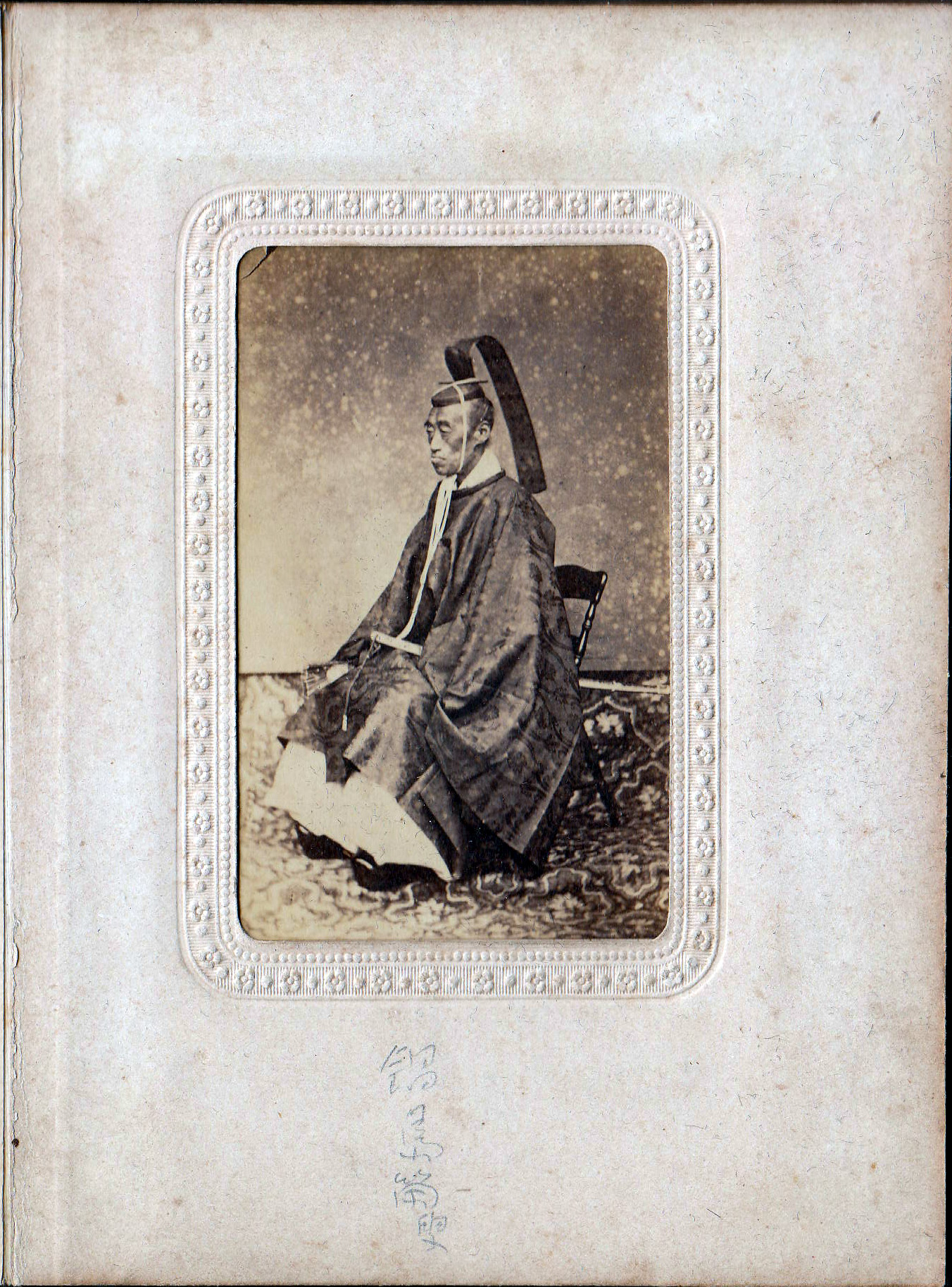
John Bingham[edit]
-
 Congressman John Bingham. He was the principle author of the Fourteenth Amendment of the U.S. Constitution.

Article(s): Equal Protection Clause
Request:
- Well, this photo was taken by the famed Civil War photographer Mathew Brady, and it has obviously been damaged. Can it be undamaged? 24.181.178.235 (talk) 10:23, 3 June 2013 (UTC)
Graphist opinion(s):![]() Done Centpacrr (talk) 16:04, 3 June 2013 (UTC)
Done Centpacrr (talk) 16:04, 3 June 2013 (UTC)
- Excellent, thanks Centpacrr.24.181.178.235 (talk) 22:39, 3 June 2013 (UTC)
Crop to make a portrait suitable for an Infobox[edit]
-
 Photo of Ivor Ichikowitz

Article(s): Ivor Ichikowitz
Request:
- Please crop the photo so that it is suitable for use as an infobox portrait. Adjust brightness, colour balance, etc if necessary. -- Roger (Dodger67) (talk) 16:50, 5 June 2013 (UTC)
Graphist opinion(s):
- Did a lossless JPEG crop with CropBot to get things started. See link above. Feel free to overwrite with adapted color and such y'all. --Kevjonesin (talk) 17:49, 5 June 2013 (UTC)
- Centpacrr, not to be a pain-in-the-posterior, but do you have a non-cropped version with the your color/contrast contribution you could upload to filename Ivor Ichikowitz Portrait Photograph (cropped).jpg? I was kinda' attached to how the 7:5 aspect ratio worked with the composition, but I like what you've done otherwise. You could upload your remixed composition (i.e. additionally cropped version) under another filename if you'd still like to have it represented. --Kevjonesin (talk) 20:22, 5 June 2013 (UTC)
- Nevermind, I thought I'd play with merging the version you'd done with the one I'd done and discovered that somehow the figure's back extends past the border of the original Ivor Ichikowitz Portrait Photograph (cropped).jpg image. I'm assuming it was actually built from File:Ivor Ichikowitz Portrait Photograph.jpg instead. As this obfuscates the file page info and defeats the purpose of having done a lossless JPEG crop in the first place, I'm just gonna' go ahead and replace it with my own retouched version. As far as File:Ivor Ichikowitz Portrait Photograph (cropped).jpg is concerned at this point consider it
 Request taken by Kevjonesin (talk) 21:11, 5 June 2013 (UTC).
- Nevermind, I thought I'd play with merging the version you'd done with the one I'd done and discovered that somehow the figure's back extends past the border of the original Ivor Ichikowitz Portrait Photograph (cropped).jpg image. I'm assuming it was actually built from File:Ivor Ichikowitz Portrait Photograph.jpg instead. As this obfuscates the file page info and defeats the purpose of having done a lossless JPEG crop in the first place, I'm just gonna' go ahead and replace it with my own retouched version. As far as File:Ivor Ichikowitz Portrait Photograph (cropped).jpg is concerned at this point consider it
- Done — Went ahead a recropped a bit while tweaking the image so I uploaded to Commons as File:Ivor Ichikowitz Portrait Photograph (cropped) 2.jpg. I'll just leave Image:Ivor Ichikowitz Portrait Photograph (cropped).jpg as is and add a note for Centpacrr. Roger (Dodger67) may then choose as he wishes what to leave in the Ivor Ichikowitz article. --Kevjonesin (talk) 00:46, 6 June 2013 (UTC)
- Cropped2 seems a bit too dark to me so that much of the detail in the right side of the subject's face is all but lost in shadow. It also strikes me that there is too much room on the right so that the figure is way off center to the left which I don't think works very well in an infobox where the image is necessarily small and is really meant to more serve the function of a "passport" photo which clearly shows what the subject looks like without too much emphasis on the "artistic". Centpacrr (talk) 01:59, 6 June 2013 (UTC)
- Hmm, well, a 3/4 profile is never quite gonna' be a front on passport photo, but I take your point about lightening up the right-side of his face a bit. And as to giving some more consideration to function over dramatic form.
- Cropped2 seems a bit too dark to me so that much of the detail in the right side of the subject's face is all but lost in shadow. It also strikes me that there is too much room on the right so that the figure is way off center to the left which I don't think works very well in an infobox where the image is necessarily small and is really meant to more serve the function of a "passport" photo which clearly shows what the subject looks like without too much emphasis on the "artistic". Centpacrr (talk) 01:59, 6 June 2013 (UTC)
- I've got my layers handy so should be fairly trivial to do. (I often do a light and dark versions and/or high/low contrast and then average them via transparency so as to have a sliding scale of adjustment at close hand.). I blame the original photographer for setting up the 'artsy' factor. : }
- IMHO, a 3/4 profile often benefits from being offset as most observers find their point of interest pulled to the front of the face and direction of the figures gaze. Seems the bright lightness pulls me that way as well. And the forward lean of the figure along with the arm reaching forward to the magazine. I wanted to leave enough for the viewer to parse some of the context as well.
- If we had a higher res original to work with I could see doing a really tight isolated shot cropped just below the shoulder that would pretty much do away with most all of the posture cues but I don't think this image will hold up to that. And tall versions centered on the body with an in between degree of cropping left me feeling a sensation of falling forward. Touch of vertigo. That's my spin on it anyway. I'll see if I can broaden the view a bit though by looking into the face lightening tip. Perhaps I can mask a bit of the highlighted side so as not to get back to a glare feeling. La-di-da off to see the GIMP... --Kevjonesin (talk) 03:25, 6 June 2013 (UTC)
- Playing with the mask and dodging got a bit more fiddly than anticipated but helped in the end I think. --Kevjonesin (talk) 05:31, 6 June 2013 (UTC)
- If we had a higher res original to work with I could see doing a really tight isolated shot cropped just below the shoulder that would pretty much do away with most all of the posture cues but I don't think this image will hold up to that. And tall versions centered on the body with an in between degree of cropping left me feeling a sensation of falling forward. Touch of vertigo. That's my spin on it anyway. I'll see if I can broaden the view a bit though by looking into the face lightening tip. Perhaps I can mask a bit of the highlighted side so as not to get back to a glare feeling. La-di-da off to see the GIMP... --Kevjonesin (talk) 03:25, 6 June 2013 (UTC)
Thanks, great job!
Kings of Portugal[edit]
-
 Peter II of Portugal
 -
 Michael I of Portugal
 -
 Ferdinand II of Portugal
 -
 Louis I of Portugal
 -
 Charles I of Portugal
 -
 Emmanuel II of Portugal


Article(s): List of Portuguese monarchs
Request:
- Could someone possibly restored these portraits please, many thanks. TRAJAN 117 (talk) 16:47, 28 May 2013 (UTC)
Graphist opinion(s):![]() Done Centpacrr (talk) 12:16, 29 May 2013 (UTC)
Done Centpacrr (talk) 12:16, 29 May 2013 (UTC)
- They look great! Many thanks. Just wondering though if you could possibly brighten up the first three portraits as they look a little too dark. TRAJAN 117 (talk) 21:04, 1 June 2013 (UTC)
Request higher resolution upload[edit]
-
 Original Lo Res image
 -
 High Res "study" for consideration


I would like this photo to become a Featured Picture because of its encyclopedic value, the bravery and ingenuity of the man, and the expression on his face. However, I need a much higher pixel upload. I know this is a little more work than just photo manipulation, but what I am asking for is to find/upload a larger version (I don't know how to do that). We can then take it through FP (you would get the credit for all the work).
TCO (talk) 16:32, 2 June 2013 (UTC)
- As there does not seem to be any high resolution versions of this particular image available on line that I have been able to find, I have made a large (3,111 × 4,400, 200dpi, 2.52 MB) "Hi Res" study of this image using PhotoZoomPro5 and Photoshop which I have also slightly sepia toned (see above) for you to consider. If you like it I can upload it to the Commons page. If you would like the sepia toning removed let me know and I can do that too. It's not perfect because the image I started with is relatively small but it may meet your needs for a larger image. Whatever you decide is fine. Centpacrr (talk) 18:41, 2 June 2013 (UTC)
- It's good work and we can add it to Fluorine (it seems to have better contrast or something). I would not overwrite the Commons image since there is so much usage in other languages. For FP, I really think we need to get a better scan or something. They are awful fussy there and will say you cheated if we just blow up an old image in size. [I think.] TCO (talk) 21:09, 2 June 2013 (UTC)
- Scanning from a printed publication (assuming you could find one) would probably not help much because the image would probably be a halftone and not very large. Not enough detail there to make it better. The best would be a true photographic print. A negative would not be needed for that (to scan from), and since there is only one original negative and who knows where it is, that's not practical either. Centpacrr (talk) 00:59, 3 June 2013 (UTC)
-
-
An individual of Berthella martensi live and in situ on a coral reef in East Timor
-APiazza.JPG)
Article(s): Berthella martensi and also Berthella
Request:
- Please crop this image of a side-gill sea slug. The image may possibly also need lightening just a little bit, so you can see the hind end of the animal better. (We are also asking the photographer to give us higher-res images if possible.) Thanks, Invertzoo (talk) 13:03, 8 June 2013 (UTC)
Graphist opinion(s):![]() Done Centpacrr
Done Centpacrr
Lobatus gigas, the queen conch[edit]
.jpg)
Article(s): Lobatus gigas
Request:
- Please take out the reflection and the brown background markings on the lower left corner of this otherwise beautiful image. Many thanks, Invertzoo (talk) 16:38, 6 June 2013 (UTC)
Graphist opinion(s):![]() Done Centpacrr (talk) 18:54, 6 June 2013 (UTC)
Done Centpacrr (talk) 18:54, 6 June 2013 (UTC)
- Sorry, Invertzoo, but your image/request got hijacked after I did to it what you asked so it looks as if you will have to deal with those who have taken it over to get the illustration resolved again the way you want it. Centpacrr (talk) 07:13, 8 June 2013 (UTC)
- It looks like from a later posting of yours that I had misunderstood your original request which seemed to me to indicate that you wanted the reflections in the shell removed as I did not really see reflections anyplace else, and that understanding of mine was I believed to confirmed when you marked my image as being resolved. Sorry I got that wrong leading to the subsequent kerfuffle. Centpacrr (talk) 23:08, 8 June 2013 (UTC)
Regarding Nagualdesign's gray version[edit]
Please note that the OP (Invertzoo) indicated satisfaction −I'd say endorsement- of the original overall composition with the exception of requested changes (e.g. "otherwise beautiful"). I'm inclined to agree. The bright pale blue is instrumental in making the orange tones of the shell pop. Centpacrr's version is sexy and satisfied the request. And the OP had already marked as "resolved". Of course one is welcome to upload the gray version under a new filename and cross link via "other versions" to provide options for future editors.
Graphists: Please see talk page for further comments.
--Kevjonesin (talk) 13:14, 7 June 2013 (UTC)
- I have reverted Kevjonesin's later version back to the one which the OP accepted as being "really great now" and resulted in her marking her request as "Resolved". Kevjonesin adequately points out the issues with Nagualdesign's after-the-fact "gray" version. The later cropped one made by Kevjonesin not only unnecessarily cut off part of the shadow, but also reintroduced the reflections from the photographic lights which the OP wanted removed and by doing so as by way of a transparency also made them look artificial. Unless there is some truly compelling reason to the contrary, there is really no reason for other editors to parachute in after a new version of an image has been accepted and marked "Resolved" by the OP as having fulfilled his or her request and start overwriting it with altogether different versions. Doing so just introduces unnecessary confusion, is generally counterproductive, and seems to me to be an ultimately unhelpful practice. Centpacrr (talk) 22:38, 7 June 2013 (UTC)
- Thread continues on the talk page. --Kevjonesin (talk) 02:00, 8 June 2013 (UTC)
- I think it's best to keep all this sort of discussion about a particular image/request in one spot (here). The Graphics Lab talk page is for talk regarding the Graphics Lab page.... not talk about specific requests. And I don't agree with this notion of "don't argue in front of the customers". Very often a better result can be had with a few editors hashing out various approaches... and no one needs to be shielded from it. – JBarta (talk) 07:52, 9 June 2013 (UTC)
- Hmm, I hear ya', but in this case my reason for forking to the talk page was largely due to the inverse. Not wanting to clutter the requests section with Graphics lab procedural discussions as debating/discussing overwriting policy was the core of what I wanted to address. It didn't seem directly relevant (of likely interest) to the OP (Invertzoo) or her request. But, yes, it also got into broader discussion of the requested image which was being used as an example and inspired the discussion.
- I can see where keeping the discussion portions about the highlights and color levels here and the new file vs. overwrite portion on the Photo workshop talk page might be more in keeping with the overall themes of the two forums but I think it's also worth considering that request threads that lead to extensive debate may well have talk page value in that they serve to document precedent for the Photography lab. They contain community views on preferred standards which may well be relevant to future work. I considered placing the copy of Invertzoo's reply —to a request for her opinion— in the requests section but it seems to me it would be tedious at this point to try to separate the organic discussion into rigidly filtered threads and still have it parse well.
- As the discussion is blended, I do think it's important that a cross link was provided in the relevant Photo workshop request subsection). Well, I suppose I actually added two links to the talk page. As one only addressed procedural issues I flagged it specifically for "Graphists:". It didn't generate nearly as much interest as the next one regarding the overall thread about the specific (Queen conch image) request. A free standing meta-topic (one which I've tried to bring up before) just isn't as sexy as one in which editors have an active immediate interest I suppose. Personally, I'd really like to have more discussion before edit conflicts arise, rather than after.
- As I look at Jbarta's preceding comment —and my reply to it— it occurs to me that we are once more discussing Graphics lab/Photography workshop procedural issues within the context of a user request section rather than on the talk page.
 I'll copy it to the talk page for posterity and further comment. --Kevjonesin (talk) 10:14, 9 June 2013 (UTC)
- As I look at Jbarta's preceding comment —and my reply to it— it occurs to me that we are once more discussing Graphics lab/Photography workshop procedural issues within the context of a user request section rather than on the talk page.

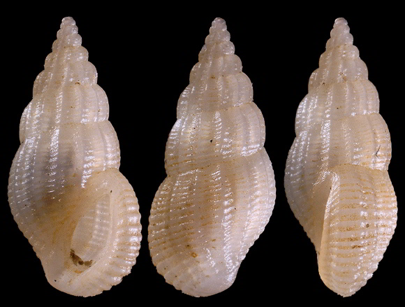
Article(s): Rissoina and Rissoinidae, also eventually Rissoina crassa
Request:
- Please adjust the color. These tiny shells should not be greenish at all. They should be a semi-translucent white. Thanks so much, Invertzoo (talk) 22:16, 8 June 2013 (UTC)
Graphist opinion(s):Is this shading correct? Centpacrr (talk) 22:44, 8 June 2013 (UTC)
Is that reduced to a black and white image? I say that because they look a bit grey, but that may be the best we can do without losing some detail. Invertzoo (talk) 22:55, 8 June 2013 (UTC)
- How about now? Perhaps the shadows ought to be more yellow/less blue? If you play around with the pearlescence too much, mind, you'll end up with a grayscale image. nagualdesign (talk) 01:49, 9 June 2013 (UTC)
- I just desaturated the greens and yellows but did not change to greyscale. You said it should be translucent white and I made it as close as I could to the shade of this species in other color pictures I found of it on the net (see here). The Nagualdesign image looks distinctly blue to me, not white. Centpacrr (talk) 01:57, 9 June 2013 (UTC)
- Umm.. I thought the requestor was supposedly the ultimate arbiter? Shouldn't you give Invertzoo the opportunity to reply to my question before deciding for yourself what the answer might be?
 nagualdesign (talk) 21:01, 9 June 2013 (UTC)
- The fact is, Nagualdesign, I was the editor who took this request and made changes based on the OPs request. I then posed a question to her about what I had done and was still in a discussion with her when you parachuted in and unilaterally overwrote the version under discussion before I could even reply to her comment to me thereby disrupting what the OP and I were doing to adjust the image to her satisfaction. Centpacrr (talk) 22:04, 9 June 2013 (UTC)
- Invertzoo commented on the desaturated version so I chipped in to offer an alternative. This is an open discussion, right? And I think you take far too much offense at having your uploads 'overwritten'. The way I see it, adding another version is contributing; all versions are available for comparison using the thumbnails at the bottom of the image page. Whereas all that reverting does, while the subject is still being discussed, is to cause arguments (see WP:OWN) and clutter the image page with unnecessary duplicates. Let's just leave the images alone and let other editors (including the requestor) contribute to the discussion or proffer other alternatives.
- @Invertzoo, you do realize that you can open several versions of an image at once (in separate tabs), right? You just (ctrl/command-) click on the thumbnails at the bottom of the image file page. Then you can switch between one tab and another to compare versions. ..I assume I'm teaching my grandma to suck eggs here! Regards, nagualdesign (talk) 22:44, 9 June 2013 (UTC)
- .."Parachuted in." LOL!
 Good one. nagualdesign (talk) 22:46, 9 June 2013 (UTC)
- I did not "revert" this image to an earlier file, but in fact made a new version from scratch as anyone can easily tell by looking at the files sizes (the earlier one is 526KB, the later is 683KB). The OP asked for the shells to be white like the ones seen here; the version you uploaded made them distinctly purple/blue. The comment the OP made was also addressed to me in response to a question that I asked which you took it upon yourself to usurp before I had a chance to address it, upload a new files, and then complained when I responded a short time later both in writing and and by producing a new version of the file to meet the OP's concerns.
- The fact is, Nagualdesign, I was the editor who took this request and made changes based on the OPs request. I then posed a question to her about what I had done and was still in a discussion with her when you parachuted in and unilaterally overwrote the version under discussion before I could even reply to her comment to me thereby disrupting what the OP and I were doing to adjust the image to her satisfaction. Centpacrr (talk) 22:04, 9 June 2013 (UTC)
- Umm.. I thought the requestor was supposedly the ultimate arbiter? Shouldn't you give Invertzoo the opportunity to reply to my question before deciding for yourself what the answer might be?
- The practice of constantly jumping in virtually immediately to ongoing requests that are being actively addressed with the OP by an editor who first accepted it only introduces unnecessary confusion, makes extra work for both the OP and original editor, and is ultimately counterproductive. So why not show a little courtesy and restraint when an editor and requester are actively working on a particular project ... at least unless and/or until there seems to be an impasse of some kind. If the editor and OP can't find a solution in a reasonable amount of time (two or three days), then that would be an appropriate time for others to offer alternative views as opposed to just creating chaos by immediately asserting themselves into every ongoing graphics discussion as self appointed doyens of the Graphic Project. Centpacrr (talk) 00:52, 10 June 2013 (UTC)
- In this instance, no, you didn't revert, you contributed. I guess I was talking more generally, as our paths cross a lot. But your edit is still devoid of any discernible colour, and doesn't address the issue that "they look a bit grey". Mine was an effort to show what colour (hopefully, correctly balanced) was available in the original image, minus the green. I'd actually desaturated a lot of it, but it does look a bit surreal. If the colours of a real shell (what little of it there is) are similar to what I'd uploaded, we'd only need to turn down the saturation, I thought. White shells can look blue-ish, can't they? Perhaps not.
- Regarding the practice of constantly jumping in virtually immediately, I'm sorry about that. We often edit at the same time of day, sometimes we clash, ce la vie. I pop my head in here, I look at images, at conversations and join in. I didn't look at the timestamps. I do my bit, whatever I fancy doing, then I'm outta here until I next come back. So yes, I do 'jump in', if that's what you want to call it, though not constantly. nagualdesign (talk) 01:55, 10 June 2013 (UTC)
- The practice of constantly jumping in virtually immediately to ongoing requests that are being actively addressed with the OP by an editor who first accepted it only introduces unnecessary confusion, makes extra work for both the OP and original editor, and is ultimately counterproductive. So why not show a little courtesy and restraint when an editor and requester are actively working on a particular project ... at least unless and/or until there seems to be an impasse of some kind. If the editor and OP can't find a solution in a reasonable amount of time (two or three days), then that would be an appropriate time for others to offer alternative views as opposed to just creating chaos by immediately asserting themselves into every ongoing graphics discussion as self appointed doyens of the Graphic Project. Centpacrr (talk) 00:52, 10 June 2013 (UTC)
- Funny, I don't see Centpacrr's "{{I take}}" tag (e.g. " Request taken.") anywhere. Must be my monitor setting, huh?
"
<!--
For wikigraphists working on the request:
{{I take|~~~~}}: when you'll be working on the request
{{Done}}: when the request is done.
-->
"
Quoted from the bottom of this section's edit page. And every other request section's edit page for that matter as it's automatically inserted every time.

Plip!
- --Kevjonesin (talk) 03:55, 10 June 2013 (UTC)
- The indication that I had taken the request and was working on it was that I had made and posted an edited image and posed a question to the OP in "Graphist opinion" section at 22:44 on June 8 asking if the shading was correct. As this was apparently not enough, however, in future I will use the "I take" tag as well and leave it there until the OP marks the request resolved. This, I trust, will avoid future confusion. Centpacrr (talk) 04:09, 10 June 2013 (UTC)
- After reading all this, I feel compelled to chime in (old habits die hard I suppose). Centpacrr, try as you may, you cannot carve out a little piece of the wiki as your own. Any editor may make any contribution and at any time they wish. You may of course use the "I take" template... and as a courtesy editors may allow you first dibs on the request. But the second you post something, expect that other editors may "parachute in" as you say with their own suggestions. At no time do you own any image or any request. And while we're on the subject... again, the requester doesn't own the image either and is not "the final arbiter" of which image is best for the article or how an image should appear. ALL editors may offer input and (ideally) a consensus should be reached. – JBarta (talk) 06:08, 10 June 2013 (UTC)
- Does this mean then, sir or madam, that you now intend to practice what you preach and cease engaging in your gainsaying penchant of unilaterally reverting much of what others including myself contribute because in your personal opinion their contributions are too light, too dark, too colorful, too dull, cropped too tightly, not cropped enough, too sharp, too fuzzy, too or not enough almost anything else, or simply "NIH"? If you are going to continuously bring up WP:OWN in here then you really need to respect it yourself. As for your continued insistence that the OP requester should not be the arbiter of whether or not his/her request has been resolved, in the absence of some truly compelling reason to the contrary, that really just defies logic and often leads to the kind of unproductive chaos exhibited in the endless omphaloskeptic threads that so often appear in here.
- After reading all this, I feel compelled to chime in (old habits die hard I suppose). Centpacrr, try as you may, you cannot carve out a little piece of the wiki as your own. Any editor may make any contribution and at any time they wish. You may of course use the "I take" template... and as a courtesy editors may allow you first dibs on the request. But the second you post something, expect that other editors may "parachute in" as you say with their own suggestions. At no time do you own any image or any request. And while we're on the subject... again, the requester doesn't own the image either and is not "the final arbiter" of which image is best for the article or how an image should appear. ALL editors may offer input and (ideally) a consensus should be reached. – JBarta (talk) 06:08, 10 June 2013 (UTC)
The current version looks very good to me. Thanks so much. A huge improvement. Invertzoo (talk) 13:09, 10 June 2013 (UTC)
Juan Carlos de Borbón[edit]
-
 Juan Carlos de Borbón

Article(s): Prince of Spain, List of Spanish regents
Request:
- Could someone possibly restore this photo please, many thanks. TRAJAN 117 (talk) 07:59, 12 June 2013 (UTC)
Graphist opinion(s):
Don't know if we'd call it "restored", but I improved it a little. – JBarta (talk) 08:35, 12 June 2013 (UTC)
- Looks much better, many thanks! TRAJAN 117 (talk) 10:09, 12 June 2013 (UTC)
Perspective fix[edit]
-
 A panoramic image of BTC City, Ljubljana, Slovenia
Article(s): Ljubljana, BTC City
Request:
- I'm told this would look better if the perspective were fixed. I don't have the slightest idea how to do that so I'm asking for help: please help! -- U5K0'sTalkMake WikiLove not WikiWar 13:28, 10 June 2013 (UTC)
Graphist opinion(s):
- I tried to improve. Have the black parts in the right lower corner really been there?--Hic et nunc (talk) 14:00, 10 June 2013 (UTC)
- Looks very much better now. Thank you. --U5K0'sTalkMake WikiLove not WikiWar 11:02, 12 June 2013 (UTC)
Karachi downtown[edit]
-
Karachi downtown
Article(s): Karachi, Corporate sector of Pakistan
Request:
- Could the quality of this image be improved? For example, by enhancing the pixels? This is an image of the central business district of Karachi, Pakistan. It is one of the few images on Wikipedia of Karachi's economic district. There are not many images on Wikipedia of skyscrapers in Pakistan. If the image has better quality, it would be one of the best photos of Karachi in my opinion. -- Mar4d (talk) 08:59, 14 June 2013 (UTC)
Graphist opinion(s):
![]() Request taken. Fallschirmjäger ✉ 19:22, 14 June 2013 (UTC)
Request taken. Fallschirmjäger ✉ 19:22, 14 June 2013 (UTC)
- Done - Worked on it as much as possible really, it was never going to be perfect considering the starting image. There is only so much that can be done to a low res image, can't bring back detail that isn't there to start with but at least it's an improvement. Kind regards, Fallschirmjäger ✉ 20:38, 14 June 2013 (UTC)
Kaʻiulani[edit]


Article(s): Kaʻiulani
Request:
- Please remove all the noise and strange color streaks from these images. Don't crop. -- KAVEBEAR (talk) 21:29, 2 June 2013 (UTC)
Graphist opinion(s):
-
 Current pic, with the bottom two images to be replaced
 -
 The image that will replace bottom left image
 -
 The image that will replace bottom right image
 -
 New collage
 -
 Another, but with wide image at top

.jpg)


Article(s): Istanbul
Request:
- We need a new montage. In Talk:Istanbul, there was agreement to replace the bottom two images. Can anyone (especially someone with a licensed copy of Adobe Photoshop) create this image? It would also be great if the resulting montage looks similar to Washington, D.C. infobox image [1], with the larger panaroma pic centered. Thanks! Cavann (talk) 06:26, 10 June 2013 (UTC)
Graphist opinion(s):
I'm curious... why "especially someone with a licensed copy of Adobe Photoshop"? – JBarta (talk) 06:29, 10 June 2013 (UTC)
- The DC montage was created with that program and it looks good. When I did montages in Paint, they did look amateurish. Cavann (talk) 06:40, 10 June 2013 (UTC)
![]() Done – JBarta (talk) 07:04, 10 June 2013 (UTC)
Done – JBarta (talk) 07:04, 10 June 2013 (UTC)
The original uploader took issue with overwriting his image, so I re-uploaded it as a derivative. It's shown above. If you wish to use it, you'll have to change links in the articles. – JBarta (talk) 01:50, 11 June 2013 (UTC)
Also added another with the wide pic at the top. In your discussions someone brought that up as an issue, so now you have that choice as well. (Seems there were already around fifteen Istanbul collages... so one more wasn't going to make much more of a mess than already exists.) – JBarta (talk) 04:04, 11 June 2013 (UTC)
Judge Robert White[edit]
-
 Portrait of Judge Robert White

Article(s): Robert White (judge) (article is in the final stages of drafting)
Request:
- To the illustrious photo editors of the photography workshop, I've chipped a black and white image of a portrait from an 1897 text of Judge Robert White, whose article I am authoring as we speak. If possible, it would be great if the image could be rotated more upright and if the quality could be sharpened and the decorative outlines be removed. Any assistance you could provide would be greatly appreciated! -- Caponer (talk) 17:13, 16 June 2013 (UTC)
Graphist opinion(s):
![]() Done – JBarta (talk) 22:09, 16 June 2013 (UTC)
Done – JBarta (talk) 22:09, 16 June 2013 (UTC)
Charles I of Spain[edit]
-
 Charles I
 -
 Charles I
 -
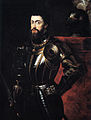 higher resolution
 -
 Titian original


.jpg)
Article(s): List of Spanish monarchs
Request:
- Could someone possibly improve the quality of these portraits please, many thanks. TRAJAN 117 (talk) 07:09, 14 June 2013 (UTC)
Graphist opinion(s):
FYI FAI (for anybody's information).... found this. And we have this. Also, you label the photos above as Charles I. Are you sure they are not Charles V? – JBarta (talk) 07:17, 14 June 2013 (UTC)
- Charles I and Charles V are one in the same, just different numeral ordinals for different titles. TRAJAN 117 (talk) 11:11, 14 June 2013 (UTC)
- TRAJAN 117, I can see where the anonymous Titian copy (1st image on left) needs some help, but what specifically would you like to see done to the Rubens (2nd from left)? IMHO, It doesn't look so bad as is. --Kevjonesin (talk) 19:07, 20 June 2013 (UTC)
- I've put in a request with the Kunsthistorisches Museum, Vienna, for a high resolution version of the Titian original. In the mean time I'll go ahead and upload a low res version I found on habsburger.net. --Kevjonesin (talk) 20:44, 20 June 2013 (UTC)
- I've uploaded to: File:Tiziano vecellio genannt tizian kaiser karl v. im harnisch mitte 16. jahrhundert original-(low res).jpg and placed a thumbnail above.
- I also added File:Peter_Paul_Rubens_-_Charles_V_in_Armour_-_after_Titian.jpg from the EPPH page link JBarta provided. --Kevjonesin (talk) 23:05, 20 June 2013 (UTC)
- TRAJAN 117, does this suit your purpose, or would you still like work done on the copy(ies)? --Kevjonesin (talk) 21:36, 20 June 2013 (UTC)
- Looks much better, many thanks! TRAJAN 117 (talk) 22:02, 21 June 2013 (UTC)
Henry Cantwell Wallace[edit]
-
 Henry Cantwell Wallace
 -
 restorated image

.jpg)
Article(s): Henry Cantwell Wallace
Request:
Graphist opinion(s):
- Done I reduced scratches and spots as good as I could, tried to get information behind bright parts and added parts when there was no more information to be found. Because of the mass of restoration I uploaded as a new file.--Hic et nunc (talk) 10:49, 21 June 2013 (UTC)
Michael L. Strang[edit]

Article(s): Michael L. Strang
Request:
- Please remove the green line on the subject's face. Feel free to make other improvements if you see fit. -- Delaywaves • talk 15:55, 21 June 2013 (UTC)
Graphist opinion(s):
![]() Done – JBarta (talk) 16:15, 21 June 2013 (UTC)
Done – JBarta (talk) 16:15, 21 June 2013 (UTC)
Signature[edit]
-
 Juan Manuel de Rosas' signature
 -
 New version w/ transparent background.

.png)
.jpg#Orientation)
.jpg)
.jpg&action=edit&redlink=1)
_2.jpg)
_2.jpg&action=edit&redlink=1)
![[1]](https://en.wikipedia.org/wiki/File:DCmontage4.jpg)
Article(s): Juan Manuel de Rosas
Request:
- Could it be possible to create a new version of this signature a little more darker and with translucid background, please?. -- Lecen (talk) 16:25, 25 June 2013 (UTC)
Graphist opinion(s):![]() Request taken by Kevjonesin (talk) 17:07, 25 June 2013 (UTC).
Request taken by Kevjonesin (talk) 17:07, 25 June 2013 (UTC).
- Done— File:Firma_del_Brigadier_General_Don_Juan_Manuel_de_Rosas-(transparent).png --Kevjonesin (talk) 19:15, 25 June 2013 (UTC)
Naomasa Nabeshima[edit]
Article(s): Saga Domain
Request:
- clean up noise... -- Kintetsubuffalo (talk) 14:32, 25 June 2013 (UTC)
Graphist opinion(s):
Found a larger version here. Cleaned it up slightly and uploaded it. Also found this, which tells me that out there somewhere is a more original and photorealistic version. – JBarta (talk) 21:38, 25 June 2013 (UTC)
- Found the original here. Uploaded it, then uploaded a crop. – JBarta (talk) 21:55, 25 June 2013 (UTC)
- Kudos JBarta! Props to your research skills. --Kevjonesin (talk) 20:03, 26 June 2013 (UTC)
- Fantastic, thanks for the legwork and thanks for pinging me!--Kintetsubuffalo (talk) 23:49, 28 June 2013 (UTC)