
Wikipedia:Graphics Lab/Photography workshop/Archive/Oct 2013
Stale[edit]
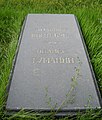
Andranik[edit]

Article(s): Andranik Ozanian
Request:
- Please improve the image and make its size smaller if necessary. -- Երևանցի talk 20:18, 6 September 2013 (UTC)
Graphist opinion(s):![]() Request taken by Centpacrr (talk) 20:28, 6 September 2013 (UTC). Cropped and cleaned up a bit. Is this what you wanted? Centpacrr (talk) 21:08, 6 September 2013 (UTC)
Request taken by Centpacrr (talk) 20:28, 6 September 2013 (UTC). Cropped and cleaned up a bit. Is this what you wanted? Centpacrr (talk) 21:08, 6 September 2013 (UTC)
- Apologies for butting in, but I have desaturated the image to a greyscale version, the discolourations don't seem to have any value. (Hohum @) 14:52, 8 September 2013 (UTC)
- There's also another version of that image here: [1] which could give a better result - except... removing that sort of horrid scan moire is something I always fail miserably at unless I get lucky and can do it by blurring and overlaying layers. Someone else might have more luck than me - I just got garbage with all the tricks I tried, including messing with FFT filters and such. Begoon talk 16:14, 8 September 2013 (UTC)
Gave this a whirl. – JBarta (talk) 09:23, 10 September 2013 (UTC)
Oldenburgsky Alexander Petrovich (Alexander Fridrih Konstantin), prince (21.06.1844- 06.09.1932).jpg[edit]
,_prince_(21.06.1844-_06.09.1932).jpg)
Article(s): Duke Alexander Petrovich of Oldenburg
Request:
- Please remove the framing and white background... -- The Emperor's New Spy (talk) 19:00, 11 September 2013 (UTC)
Graphist opinion(s):
- Cropped and took a couple of blatant spots out - didn't do anything else. Begoon talk 19:09, 11 September 2013 (UTC)
- I'm not a big fan of enlarging an image, but sometimes when it's very small, enlarging can be useful. I enlarged it and grayscaled it. Whether that's an improvement is debatable... but I tend to think it is. (I should also mention I searched in vain for a larger/better copy, but came up with nothing... though I suspect a better copy is out there... somewhere...) – JBarta (talk) 22:15, 12 September 2013 (UTC)
Walter Johannes Damrosch[edit]

Article(s): Walter Damrosch
Request:
- um, yeah, can we, well, shoot, de-Draculafy this picture...? -- Kintetsubuffalo (talk) 16:00, 19 September 2013 (UTC)
Graphist opinion(s):![]() Request taken by Centpacrr (talk) 16:49, 19 September 2013 (UTC).
Request taken by Centpacrr (talk) 16:49, 19 September 2013 (UTC).
- Found and uploaded a better quality and less "Draculafied" copy. – JBarta (talk) 18:23, 19 September 2013 (UTC)
- Let me ask, would it take away from the historicity of the picture to just remove the background?--Kintetsubuffalo (talk) 03:22, 21 September 2013 (UTC)
- Well, the problem is that his head blends into the background, so we'd have to make up the outline of his head. I don't think that would look so good (see Centpacrr's edit). Personally, as it is now, I don't think it's all that bad. – JBarta (talk) 10:21, 21 September 2013 (UTC)
- Agreed - the definition isn't there to put it on a background other than black without "making it up", and that would look horrid. I even had a play, but it looked like a Fisher-Price my-first-cutout. Don't think it's possible, although I can understand why you might think of it - just not this image ... Begoon talk 20:11, 21 September 2013 (UTC)
- Well, just to be clear.... it's possible. A skilled artist could essentially draw in the back of his head and/or alter the image any way we wish. The result would be half photo and half painting. And I won't kid myself into thinking I'm skilled enough to go there and get a presentable result. Not to mention the sticky WP:RS and WP:OR issues we'd start bumping into. – JBarta (talk) 22:09, 21 September 2013 (UTC)
- For sure. And some requesters here would maybe like us to draw him in Helvetica so that they could use him as a type-only logo (sarcasm intended, and not aimed at you, Chris).
 . In the realms of sensible options though, he's gonna be on a black background or he's gonna be a derivative drawing. Begoon talk 22:51, 21 September 2013 (UTC)
- Cleaned up moiré pattern in substitute image. Centpacrr (talk) 00:41, 22 September 2013 (UTC)
- Um, no... you didn't clean up anything. You pasted the face of the old image into the new image. Not only was the edit worse, but you reintroduced the heavy shadows that contributed to the "Dracula" effect. Yes, there is residual regular noise in the image and yes, it would be nice if it could be removed... but not with a hack copy and paste. – JBarta (talk) 01:06, 22 September 2013 (UTC)
- Sigh, well there you go again. Sorry but the image with the moiré patterned looks absolutely crappy to the point of being unusable on WP when there are alternatives available. Also there is absolutely nothing wrong with the technique of compositing elements from other versions of the same image without the moiré issues to fix the face and shirt in order to get the best of both images. That being said, I'm really not interested in spending the time and effort to get in to yet another one of these kerfuffles with you about what's "best". So instead I'll just leave your inferior version there and move on to other requests as no matter what I might do to fix it I presume you would, as usual, just revert it again because it doesn't suit your personal taste. (NGDGUP) Centpacrr (talk) 01:41, 22 September 2013 (UTC)
- Um, no... you didn't clean up anything. You pasted the face of the old image into the new image. Not only was the edit worse, but you reintroduced the heavy shadows that contributed to the "Dracula" effect. Yes, there is residual regular noise in the image and yes, it would be nice if it could be removed... but not with a hack copy and paste. – JBarta (talk) 01:06, 22 September 2013 (UTC)
- Cleaned up moiré pattern in substitute image. Centpacrr (talk) 00:41, 22 September 2013 (UTC)
- For sure. And some requesters here would maybe like us to draw him in Helvetica so that they could use him as a type-only logo (sarcasm intended, and not aimed at you, Chris).
- Well, just to be clear.... it's possible. A skilled artist could essentially draw in the back of his head and/or alter the image any way we wish. The result would be half photo and half painting. And I won't kid myself into thinking I'm skilled enough to go there and get a presentable result. Not to mention the sticky WP:RS and WP:OR issues we'd start bumping into. – JBarta (talk) 22:09, 21 September 2013 (UTC)
Cinepoly Records[edit]
Article(s): Cinepoly Records
Request:
Graphist opinion(s):
to sharpen an emblem, that as is cropped from other image, it's resolution is too poor.[edit]
- Discussion revisited In December 2013.
-
 "Arab Liberation Army" armored vehicle, with an emblem on the side of the car
 -
 "Arab Liberation Army" emblem. Since this file can not be used, there is a need to reconstruct it , based on the emblem on the side of the car ( the image on the left)

.svg)
Article(s): 1947–48 Civil War in Mandatory Palestine
Request:
- Is it possible to sharpen a part of this image: "Arab Liberation Army" armored vehicle ?
As seen in this article , below this image I have inserted an image of the emblem found on the side of the armored car. However, this image was deleted because of wp:or claim. Hence I tried to crop the "Arab Liberation Army" armored vehicle image in order to have an image of the emblem only. However, the resolution of the cropped image (with the emblem) is too poor. Is it possible to crop and sharpen the emblem ? -- Ykantor (talk) 21:45, 20 September 2013 (UTC)
Graphist opinion(s):
- The emblem in the photo is of such poor quality that nothing useful can be derived from it. And this edit summary makes no sense to me, so I'm not sure how to comment further. – JBarta (talk) 22:28, 20 September 2013 (UTC)
- What fascinates me about the logo in the photo is that it doesn't appear to have even a hint of shadow in the area where the armoured car body is in shadow compared to where it isn't. It's very starkly white against the car, so maybe it's an optical illusion - or more likely overexposure because there's a similar effect on the door frame - but it looks very clean and white in that shot. I'm probably just an old cynic, but I also wondered why they would paint it "round the corner" like that. Begoon talk 01:00, 21 September 2013 (UTC)
- Note that there is another version of this emblem (white with green background) on Wikimedia at [2]. --Mark viking (talk) 01:12, 21 September 2013 (UTC)
- Yeah, I saw that - but now you made me look at the source, which I didn't before - which is this picture: [3]. Much clearer there, but still seems, oddly, to have the same, magical shadow-repellent characteristics. Maybe it's the paint ? Perhaps these are just old-fashioned pre-digital retouches, to emphasise the logo for printing in books - but they sure look a little odd if you stare at them. Begoon talk 01:17, 21 September 2013 (UTC)
- This one, though: [4] is a classic. (File:The army of liberation works wonders al mussawar 19480403.jpg). "Works wonders", indeed - the magic paint apparently can be applied to thin air beneath the motorcycle body...
- Yeah, I saw that - but now you made me look at the source, which I didn't before - which is this picture: [3]. Much clearer there, but still seems, oddly, to have the same, magical shadow-repellent characteristics. Maybe it's the paint
- My opinion would be that all of those images are at least somewhat "dubious". That's not to say the emblem doesn't or didn't exist - just that I wouldn't be entirely happy with any of these as a source for its usage. Begoon talk 01:49, 21 September 2013 (UTC)
- That motorcycle picture clinched it for me. Almost certainly doctored images. I added conspicuous notes to the image description pages of both files. I also removed the truck image from en:WP articles and left notes on the talk pages (1,2,3). The motorcycle pic was used in one article, but since it was merely presented as a "propaganda poster" it wasn't entirely misleading. – JBarta (talk) 09:05, 21 September 2013 (UTC)
- Good moves - I was going to do something similar, but it's always better with more than one opinion - though I'm not in much doubt after examining them all. Begoon talk 09:46, 21 September 2013 (UTC)
- Seems the "hoax" aspect of these images has been discussed before. – JBarta (talk) 10:05, 21 September 2013 (UTC)
- Yeah - well "kept because even if it's a hoax, we may want to discuss the hoax" - sort of ok, I guess, if we are clear that's what we are doing - but it's a fair point that us having it, and named like that, makes it very "googleable" and if it's a hoax we could be seen to be perpetuating it... I have, as I said, no idea if the emblem is genuine - but I am pretty certain that these particular images are no reliable source for it. Begoon talk 10:32, 21 September 2013 (UTC)
- Seems the "hoax" aspect of these images has been discussed before. – JBarta (talk) 10:05, 21 September 2013 (UTC)
- Good moves - I was going to do something similar, but it's always better with more than one opinion - though I'm not in much doubt after examining them all. Begoon talk 09:46, 21 September 2013 (UTC)
- That motorcycle picture clinched it for me. Almost certainly doctored images. I added conspicuous notes to the image description pages of both files. I also removed the truck image from en:WP articles and left notes on the talk pages (1,2,3). The motorcycle pic was used in one article, but since it was merely presented as a "propaganda poster" it wasn't entirely misleading. – JBarta (talk) 09:05, 21 September 2013 (UTC)
- My opinion would be that all of those images are at least somewhat "dubious". That's not to say the emblem doesn't or didn't exist - just that I wouldn't be entirely happy with any of these as a source for its usage. Begoon talk 01:49, 21 September 2013 (UTC)
- I posted this issue. I agree to the deletion. If it is supposedly a fake, it should not be in the article. I am not a photo expert, and do not have any idea whether it is a fake.
- However, It is rather strange, why should someone fake an emblem, while the real one was about the same. e.g. book "1948: The First Arab-Israeli War" by Benny Morris, chapter "Operations Yoav and Hiram", page 340, "Qawuqji’s troops fled in the direction of the Jermak...We captured two...armored vehicles taken from us in the Yehiam Convoy and now decorated with the symbol of the ALA, a bent dagger dripping blood, stuck in the heart of a Shield of David"
- Moreover, user:Jbarta reffered to this older discussion in which User:Darwinius has opposed the image but later realized that the photo is not fake: "I'm sorry, the camouflage painting tricked me on this one. I've identified the vehicle and it does not bend, indeed.--- Darwin Ahoy! 22:34, 23 April 2011 Ykantor (talk) 12:00, 21 September 2013 (UTC)
- Honestly, I don't know why. I've just given my opinion that all of those images look manipulated to me. As to when, why, or by whom - your guess is as good as mine, and certainly in the case of the armoured car ones it's not absolutely impossible that it was just a retouch for printing or overexposure (but that's not what I'd bet on if I had to use my own money). The motorbike one I can't see as genuine at all. I wouldn't treat any of these images as a reliable source for that emblem - that's as far as my opinion goes, it's about these images, and I have no knowledge as to the authenticity or not of the emblem itself or any theoretical "motive".
- One thing you might consider though, is that I had no knowledge of any prior discussions on this - and merely started to look because the image was here, and to see if I agreed with JB that we couldn't get anything from that photo. It looked odd to me, so I looked further, and everything I found didn't look quite right. In that way, I'm utterly independent. Begoon talk 12:41, 21 September 2013 (UTC)
- It is highly dubious that this emblem would be the one of the ALA. For the technical reasons that were discussed here and two years ago on WP:Commons but also on historical grounds. This emblem is antisemite and would be a clue that the aim of the ALA would have been to destroy Israel.
- The charge of Arab antisemitism is reccurent in the Israeli discourse as well as the idea that the aim of the Arab armies in '48 was to destroy Israel. But historians say that they don't know what were the aims of the Arab armies in '48. And the charge of antisemitism was never proven and is still controversial among historians.
- If the emblem of the ALA would have been that one, there would be hundreds of such pictures given the ALA was totally overwhelmed during Operation Hiram. The charge of antisemitism and aim to destroy Israel would also be given more weight.
- Pluto2012 (talk) 18:21, 21 September 2013 (UTC)
Actually, on closer look and after reading the previous deletion discussions, it seems in the armored vehicle and the motorcycle what looks like shadows or bends in the metal may actually be camouflage paint. This seems very clear in the AV, though not entirely clear in the motorcycle. This might go against the idea the photos were doctored. Begoon, what do you think? – JBarta (talk) 18:42, 21 September 2013 (UTC)
- My opinion's the same as it was. I think they are probably manipulated. It's a no smoke without fire thing, if you like - yes, you can take each niggle and explain it away if you try to - but too many niggles, and not really convincing explanations, and I arrived there independently, by accident really, without any knowledge that I was not the first person to do so. I could be wrong - ask my wife, I often am - but as I said above, I'm not putting a penny of my money on any of them being genuine. The magic shadow repellent paint, the strange, cut edges on [5], the placement and perspective, and above all, they just damn well look wrong - and, sorry, that motorcycle shot, no, no matter how hard I squint... It floats in the air in front of the bottom of the seat... In fact the whole thing looks about 3 or 4 inches in front of the machine which it conforms to in no way at all... It's just very wrong... That's it for me, though, I have little more to offer - if I'm wrong, I'm wrong - but I'm a non-believer... My AGF fails on this. Begoon talk 18:55, 21 September 2013 (UTC)
- In the motorcycle image the seat is not really visible. The emblem is painted on (or was added to) the gas tank. It's conceivable the light and dark areas of the tank is camouflage paint rather than shadows or empty space. Possibly instead of floating in mid-air, the emblem is actually painted onto a darkly painted section of tank. Regarding this particular image, do think that could be the case? – JBarta (talk) 20:14, 21 September 2013 (UTC)
- Yeah, ok - it's not the seat - fair point . Whatever part of the motorcycle that is it still floats unnaturally and out of perspective in front of it, and even if you stretch credulity and accept that the top part could be some sort of paint rather than shadow (which I don't believe) - there's no way the bottom part is. That's thin air. And, notwithstanding any of that, as I said, it just looks wrong, and it is wrong, and you won't convince me otherwise, sorry... Begoon talk 20:47, 21 September 2013 (UTC)
- Ok - I take that back - if I close one eye and squint sideways I can make a different shape out of that bottom part. It's like one of those 3d puzzles... So let's say I gave you that... You still think it's not superimposed? When it still so obviously looks so. This would be one hell of a coincidence on all those pics. (squinting again I still prefer my first interpretation, by the way) I'm giving you the shape for argument's sake, although I'm not convinced, but even then it's pure white, consistently, all round, and so, so unnatural it's not true, and it just doesn't look like the rest of the shot in any way. Sorry, still a no, here - but you're good at sowing seeds of doubt... Still all too wrong overall for me, though
- I'm going to stick with the balance of probabilities. These pictures I randomly came across that all look very wrong in so many different ways do not do so for no reason. You're still not getting my penny. Begoon talk 21:01, 21 September 2013 (UTC)
- I relaxed the tone of the note on the image description page of the armored vehicle and motorcycle from basically "it's doctored" to "it might be doctored". I think we can all agree they look doctored... though whether they really are has become a little murkier in my opinion. – JBarta (talk) 23:36, 21 September 2013 (UTC)
- Yeah, ok - it's not the seat - fair point
- In the motorcycle image the seat is not really visible. The emblem is painted on (or was added to) the gas tank. It's conceivable the light and dark areas of the tank is camouflage paint rather than shadows or empty space. Possibly instead of floating in mid-air, the emblem is actually painted onto a darkly painted section of tank. Regarding this particular image, do think that could be the case? – JBarta (talk) 20:14, 21 September 2013 (UTC)
- Those are 2 different cars.
- This one is a C15TA Armoured Truck, with a good photo here
 this is an Otter Light Reconnaissance Car (with a nice photo here). There is no shade on the emblem. It is probably a camouflage paint. I am not sure what is the significance of this fact. Ykantor (talk) 19:49, 23 September 2013 (UTC)
Photographs from old newspaper[edit]


Article(s): Armenian Genocide, Confiscated Armenian property in Turkey
Request:
- I know it's almost an impossibility of fixing the first photograph entirely. But can there be anything done? The original source is here. The second photograph is better to work with. I can REALLY appreciate it if improvements can be done to at least make it a little more intelligible. Also, is there any way we can get a better scan perhaps? Or find the same newspaper from a different website? Proudbolsahye (talk) 19:57, 27 September 2013 (UTC)
- @Jbarta. Nevermind my last post...sorry, I misread. Are improvements still ongoing? Proudbolsahye (talk) 00:52, 28 September 2013 (UTC)
- Not by me. But Quibik improved them a bit. – JBarta (talk) 19:36, 29 September 2013 (UTC) -- Actually, on closer look, he did quite a remarkable job cleaning up some of that mess. – JBarta (talk) 08:16, 30 September 2013 (UTC)
- Thank you! It is indeed a remarkable job!! :) Proudbolsahye (talk) 21:38, 30 September 2013 (UTC)
- Not by me. But Quibik improved them a bit. – JBarta (talk) 19:36, 29 September 2013 (UTC) -- Actually, on closer look, he did quite a remarkable job cleaning up some of that mess. – JBarta (talk) 08:16, 30 September 2013 (UTC)
- @Jbarta. Nevermind my last post...sorry, I misread. Are improvements still ongoing? Proudbolsahye (talk) 00:52, 28 September 2013 (UTC)
Graphist opinion(s):
- Uploaded versions taken from the JP2 images they offer. A little better than the heavily artifacted PDF versions. (PDF anything is best avoided if at all possible... PDF software often compresses images into crap.) – JBarta (talk) 23:19, 27 September 2013 (UTC)
Preparations of resistance[edit]

Article(s): Clarence Ussher, Van Resistance
Request:
- Very valuable photograph. Needs to be lightened up a bit. Please improve quality if you can. I just needs to look a little more intelligible. If you can find a better quality photo that'll be great as well (source: An American Physician in Turkey: A Narrative of Adventures in Peace and in War) Thanks in advance. Proudbolsahye (talk) 23:19, 30 September 2013 (UTC)
- I think were back to the beginning with the photograph. No changes have been made. If it's impossible to make changes, that is fine with me. I'm just wondering if further improvements are to be made. Proudbolsahye (talk) 07:43, 1 October 2013 (UTC)
- Any updates on this? Proudbolsahye (talk) 06:30, 3 October 2013 (UTC)
Graphist opinion(s):
- I uploaded a higher resolution scan from archive.org... but it's not really an improvement... might even be worse. – JBarta (talk) 01:13, 1 October 2013 (UTC)
Armenian Revolutionary Federation[edit]
-

-

-
 combination of Centpacrr & Begoon edits


Article(s): Armenian Revolutionary Federation
Request:
- flatten out soggy paper effect... -- Kintetsubuffalo (talk) 10:50, 2 October 2013 (UTC)
Graphist opinion(s):![]() Request taken by Centpacrr (talk) 11:58, 2 October 2013 (UTC).
Tweaked and softened background. Centpacrr (talk) 12:49, 2 October 2013 (UTC)
Uploaded a new version as I discovered that I had previously saved the wrong study so I redid it from scratch as I had lost the study I had intended to use. Centpacrr (talk) 05:10, 3 October 2013 (UTC)
Request taken by Centpacrr (talk) 11:58, 2 October 2013 (UTC).
Tweaked and softened background. Centpacrr (talk) 12:49, 2 October 2013 (UTC)
Uploaded a new version as I discovered that I had previously saved the wrong study so I redid it from scratch as I had lost the study I had intended to use. Centpacrr (talk) 05:10, 3 October 2013 (UTC)
- Heh, yeah - that's much better than the previous one - gets confusing with multiple versions - I do that all the time. Begoon talk 06:23, 3 October 2013 (UTC)
Just for fun, I tried a different approach to this. I figured the background was so far gone as to be unsalvageable, so may as well just lose it, but try not to "wash out" the drawing.
So I created a "retouch" derivative, above, which tries to do that, with a neutral, "notepaperish" replacement background. You might not like it (I'm not sure I do), and you might think it takes too many liberties and ends up "unencyclopedic" - but there it is, to love or hate...
I also uploaded a version with no texture in the background to see what that looked like, here: (link...).
I still have the photoshop master, so you could have any percentage opacity of that texture between the two extremes... (and I can adjust the contrast etc. of just the drawing independently (it's a separate layer) if it's too dark...) Begoon talk 04:46, 3 October 2013 (UTC)
- Both are great, thank you guys, not sure which one to use...--Kintetsubuffalo (talk) 10:55, 3 October 2013 (UTC)
- Get someone to write a script that shows them on alternate days... Begoon talk 14:12, 3 October 2013 (UTC)
- Perplexing problem to be sure, but I think I solved it... I combined the two images ;-) – JBarta (talk) 14:35, 3 October 2013 (UTC)
- Works for me. I did actually consider that - a kind of "best of both worlds" - but you did a fine job, with a fresh pair of eyes. If we're not careful, someone will think this is teamwork... Begoon talk 14:52, 3 October 2013 (UTC)
- As the original host page is live linked to 24 different articles in a dozen different Wikipedia projects, I have moved the final combined version of the image file to that original page so that those links don't have to be recreated on another page to live access the file. Centpacrr (talk) 16:32, 3 October 2013 (UTC)
- Actually you altered that final combined version before you uploaded it. Now it's lighter. You couldn't just go with the compromise? You had to wedge in one more edit? – JBarta (talk) 16:53, 3 October 2013 (UTC)
- I must admit, I'm forced to agree. The retouch2 was a good compromise on detail and contrast. I put a fair amount of effort into achieving that, and JB's merge was good. Someone talked about wasted time recently...
Ah, well... whatever, I'm not going to get into one of those long to and fros, they're boring. I'm disappointed, though, I have to say, if I'm honest, that you said you'd moved it when what you actually did was alter it. I was happy with a file we created together and that seems like "trying to have the last word" in a way.
The lack of openness and need to be "right" on this page makes me wonder why I bother sometimes. Egos, huh? Who'd have 'em? I was pleasantly pleased it seemed for a minute the answer on this one was nobody. Better things to do than debate it though... Begoon talk 17:16, 3 October 2013 (UTC)
- In fact, bugger it, on reflection, I uploaded the consensus version over the "altered" version. I wish I hadn't needed to, but I felt I did, and that's my considered judgement. Time for this infighting to stop, and I'm hugely disappointed that a seemingly positive step in that direction came to naught, again...
We're all talented people here (apart from me, obviously), and we can all learn from each other. Anything else just pisses me off, frankly, and I'd love it if we could stop that sort of thing.
Anyone see the picture of the lizard on Mars? Begoon talk 17:36, 3 October 2013 (UTC)
- As the original host page is live linked to 24 different articles in a dozen different Wikipedia projects, I have moved the final combined version of the image file to that original page so that those links don't have to be recreated on another page to live access the file. Centpacrr (talk) 16:32, 3 October 2013 (UTC)
- Works for me. I did actually consider that - a kind of "best of both worlds" - but you did a fine job, with a fresh pair of eyes. If we're not careful, someone will think this is teamwork... Begoon talk 14:52, 3 October 2013 (UTC)
- Perplexing problem to be sure, but I think I solved it... I combined the two images ;-) – JBarta (talk) 14:35, 3 October 2013 (UTC)
- Get someone to write a script that shows them on alternate days...
- lizard on Mars?--Kintetsubuffalo (talk) 12:39, 4 October 2013 (UTC)
- (link...) Just google "lizard on mars". Then google "pareidolia". But it's a great picture if you like that sort of thing.
...and for your bonus question, identify the origin of this quote: "I love humans...always seeing patterns in things that aren't there." Begoon talk 13:15, 4 October 2013 (UTC)
- (link...) Just google "lizard on mars". Then google "pareidolia". But it's a great picture if you like that sort of thing.
- Doctor Who?--Kintetsubuffalo (talk) 13:42, 4 October 2013 (UTC)
Human suffering[edit]

Article(s): Hamidian massacre
Request:
- VERY valuable photograph of Armenian refugees during the Hamidian massacre. Has a lot of problems though. Needs to be cropped. The scratches and blots found throughout the photograph needs to be removed. The writings above needs to be removed also. Perhaps sharpening or darkening the outlines of the figures to better show them can be nice as well (i.e. the features of the babies head is kinda unnoticeable). I'm planning on submitting this as a Featured Picture candidate so I would love to use your help and support. Remember this is a very very valuable photograph, take gentle care of it ;) Thanks in advance! Note: I have a .tiff version of the file which is over 15+ mb. Do you guys think that would be considered better quality? If so, I can upload it. Proudbolsahye (talk) 21:38, 3 October 2013 (UTC)
Graphist opinion(s):![]() Request taken by Centpacrr (talk) 23:13, 3 October 2013 (UTC).
Removed writing on glass plate and cleaned up as requested. Centpacrr (talk) 02:38, 4 October 2013 (UTC)
Request taken by Centpacrr (talk) 23:13, 3 October 2013 (UTC).
Removed writing on glass plate and cleaned up as requested. Centpacrr (talk) 02:38, 4 October 2013 (UTC)
- Found my way here from the FPC page, which I just commented on. Without wishing to snub Centpacrr, would anybody else care to take a crack at this one, being mindful of the FPC comments? I'd do it myself... just.. not right now.
 Regards, nagualdesign (talk) 03:39, 19 October 2013 (UTC)
Resolved[edit]
Georgios Papadopoulos[edit]
File:Georgios Papadopoulos.png File:Georgios Papadopoulos crop.png
Article(s): Georgios Papadopoulos
Request:
- new trimmed version, no text or border, a new one probably should be made... -- Kintetsubuffalo (talk) 00:37, 29 September 2013 (UTC)
Graphist opinion(s):
- File:Georgios Papadopoulos crop.png. You might want to edit description/rationales - I just copied the old one. (the "pink" appears to be "pink" paper it was printed on - I think it's legit to adjust levels for that (which is the only thing I did to the colour) - but we can put it back if you prefer...) Begoon talk 02:34, 29 September 2013 (UTC)
- Wow, that is significantly better, thank you!--Kintetsubuffalo (talk) 04:13, 29 September 2013 (UTC)
- I also tried it without the background - no background (link...) - but it looked a bit too stark and cut-out to me, so I reverted that. Begoon talk 06:36, 29 September 2013 (UTC)
- ...and with a grey "gradient background": grey gradient (link...) - but I'm not entirely happy with that, had to blur the edges of the head a tiny bit, and it's probably changing a bit too much, but there in the history if anyone wants it. Begoon talk 06:54, 29 September 2013 (UTC)
- Wow, that is significantly better, thank you!--Kintetsubuffalo (talk) 04:13, 29 September 2013 (UTC)
Badly corrupted image[edit]
-
 Trumbull County Courthouse: Ohio, USA

Article(s): No articles
Request:
- Umm, I don't know what to request with this one. Is it even fixable? Nyttend (talk) 13:14, 30 September 2013 (UTC)
Graphist opinion(s):![]() Done Centpacrr (talk) 13:43, 30 September 2013 (UTC)
Done Centpacrr (talk) 13:43, 30 September 2013 (UTC)
- Thanks! I distinctly remember this image looking fine at some point in the past; I wonder if newer editions of MW couldn't get the corrupted bits to appear properly. Nyttend (talk) 13:49, 30 September 2013 (UTC)
- Nice job Centpacrr... how did you do it? (the color-adjusting part that is) – JBarta (talk) 17:39, 30 September 2013 (UTC)
- Ah, nevermind. I figured it out. – JBarta (talk) 21:58, 30 September 2013 (UTC)
- Nice job Centpacrr... how did you do it? (the color-adjusting part that is) – JBarta (talk) 17:39, 30 September 2013 (UTC)
Needs quality improvement[edit]
Proudbolsahye (talk) 08:36, 4 October 2013 (UTC)
-
 Description of first image

Article(s): Henry H. Riggs
Request:
- Is there any way we can improve the quality of this photograph? Get rid of the spots maybe? I tried to do it myself...maybe I did more harm then good. The original is here: [6]. -- Proudbolsahye (talk) 17:51, 8 September 2013 (UTC)
Graphist opinion(s):![]() Request taken by Centpacrr (talk) 17:57, 8 September 2013 (UTC). Reduced/cleaned up moiré pattern issue. Centpacrr (talk) 23:23, 8 September 2013 (UTC)
Request taken by Centpacrr (talk) 17:57, 8 September 2013 (UTC). Reduced/cleaned up moiré pattern issue. Centpacrr (talk) 23:23, 8 September 2013 (UTC)
- Gave this a shot myself. – JBarta (talk) 09:24, 10 September 2013 (UTC)
- Thank you so much! Looks great! Proudbolsahye (talk) 23:49, 17 September 2013 (UTC)
Mustafa Arif[edit]
Proudbolsahye (talk) 08:36, 4 October 2013 (UTC)

Article(s): I am planning to make an article on him soon.
Request:
- The quality is horrible. I would love to see ANY improvements to the photograph. Proudbolsahye (talk) 23:51, 17 September 2013 (UTC)
Graphist opinion(s):
- Made it a little darker and blurred it some. A little better I suppose. Are there no other pictures of this person? – JBarta (talk) 01:46, 18 September 2013 (UTC)
- I found another one here...http://www.mulkiyeteftis.gov.tr/ortak_icerik/mulkiyeteftis/mustafa_arif_k.jpg ...I'm just not 100% sure if it is him. You would say this is a better picture huh? Proudbolsahye (talk) 05:44, 18 September 2013 (UTC)
- It's a little better yes, but they seem to be of different times. The one you mention above looks more modern. If it's a choice between a bad image that you know is him and a better image that you're not so sure about... stick with the one you know is him. Also, in case you weren't aware, he has an article on the Turkish Wikipedia. – JBarta (talk) 13:04, 18 September 2013 (UTC)
- I found another one here...http://www.mulkiyeteftis.gov.tr/ortak_icerik/mulkiyeteftis/mustafa_arif_k.jpg ...I'm just not 100% sure if it is him. You would say this is a better picture huh? Proudbolsahye (talk) 05:44, 18 September 2013 (UTC)
Armenian orphans[edit]
Proudbolsahye (talk) 08:37, 4 October 2013 (UTC)

Article(s): Armenian Genocide
Request:
- Please remove the watermark in the center fold and improve it as much as possible. Also, please retain the original colors. -- Երևանցի talk 00:57, 23 September 2013 (UTC)
Graphist opinion(s):![]() Request taken by Centpacrr (talk) 03:29, 23 September 2013 (UTC).
Request taken by Centpacrr (talk) 03:29, 23 September 2013 (UTC).
- oops.. uploaded an edit, then came back here and saw your take. Now he'll have a couple to choose from I suppose. – JBarta (talk) 04:08, 23 September 2013 (UTC)
 Done. We've had this discussion in here before, JBarta, and I thought this issue had been resolved. If an editor wants to take on a complex restoration request like this one, the accepted practice (as well as considerate thing to do) is to mark the request "taken" so as to not waste the time of other editors. If you had done so then I would have been never taken this on and been instead able to spend the time I did restoring this image doing another project. Centpacrr (talk) 05:16, 23 September 2013 (UTC)
- I'm interested in the photograph as well. Do you think it was better to leave the colors unsaturated so as to conform with the originality of the photograph? Proudbolsahye (talk) 05:33, 23 September 2013 (UTC)
- If it's a matter of someone's time being wasted... how do you know it was your time that got wasted? Maybe it was my time that got wasted doing this complex restoration project. How can you tell the difference? – JBarta (talk) 05:37, 23 September 2013 (UTC)
- Just what do you think the purpose of the "Taken" tag is then? If you wanted to take the request all you had to do is post the tag in its request section before anyone else did and there would have been no problem. Complaining now that it was your time that was "wasted" when you never did so is just disingenuous sophistry. Centpacrr (talk) 06:21, 23 September 2013 (UTC)
- Doesn't matter who took it on our end...you guys are both heroes! Thanks :) Proudbolsahye (talk) 07:17, 23 September 2013 (UTC)
- Again more sophistry, JBarta, and I have to believe that you really do know better. You wasted my time on this project by failing to disclose to the community that you were working on the request. If I had known that I would have passed on it as there is no need for two editors to simultaneously duplicate the effort on a complex project like this. After all the Graphics Workshop is not meant to be an involuntary competition.
- When an editor fails to follow the established procedure of posting a "Taken" tag before working on a request such as in this case, and another editor does post the tag and completes the project in good faith, the undisclosed editor has by definition waived any legitimate claim to having his or her time "wasted" because he or she knowingly and voluntarily took that risk by doing the work in secret. Therefore even though the image I did is "live", my time was still constructively "wasted" by your failure to follow this established procedure designed specifically to avoid these conflicts.
- Any claim of "wasted" time on your part, however, is specious and irrelevant because you both failed to disclose that you were working on it in advance and also to assure yourself that nobody else had disclosed that he or she had accepted the request. So in the future when you want to work on a complex request like this, before doing so please have the courtesy to disclose that intention to the community by posting a "taken" tag on the image's request section so that you don't again inconvenience and waste the time of your fellow volunteer WP contributors. Centpacrr (talk) 07:45, 23 September 2013 (UTC)
- That's interesting. So my time was not wasted because in this instance I gave up the ability to even entertain the concept of having wasted my time. And you, by the mere entry of my edit, automatically had your time wasted. That doesn't seem fair actually. Seems like you've stacked the deck heavily in your favor. I have a hard time accepting that I had given up so much and inflicted so much harm by simply omitting a teeny little template. Oh, and there's no duplicated effort... not quite. Mine's just a little better than yours ;-) (though props for giving that one kid a respectable eye) – JBarta (talk) 08:09, 23 September 2013 (UTC)
- Well we all know that your standard view is that whatever you do in here is always "better" than what anybody else does so that's a pretty empty argument. As I explained above, the point of using the tag is to avoid leading to unnecessary duplicate efforts on the part of others. If you still don't understand that simple concept then I guess there is not much else I can do to help you with that. If you feel that your time was wasted then the only one you have to blame for that is yourself for failing to disclose in advance that you were working on the request. I have not "stacked the deck" in anybody's favor, I just followed the established procedure for disclosing to the community when I have accepted a request and you didn't. Centpacrr (talk) 08:54, 23 September 2013 (UTC)
- Couldn't you at least throw me a bone here? That even if completely undeserving and totally my fault, maybe it was my time that was wasted? Maybe not my wasted time alone, but wasted in addition to yours? It doesn't even have to be on the same level as your wasted time, but maybe some sort of a lesser wasted time? I realize I'm to blame here, but at least allow me something. – JBarta (talk) 09:23, 23 September 2013 (UTC)
- Sure you can personally feel that you "wasted" time on this, my point is the reason that happened (which I am glad you now accept) is that you failed to tag it as "taken" before you expended that effort. If you had I would have respected that and thus never taken on the project, and your time would never have gone for naught. Simple as that. Centpacrr (talk) 09:38, 23 September 2013 (UTC)
- Of course I can feel anything "personally".... but I'm asking if YOU would acknowledge that I wasted my time. Though you did say my time went "for naught"... which is sort of like saying I wasted my time. Still though, it would make me feel better if you said I wasted my time just as much as you did... using the term "wasted time" rather than "for naught". I realize that considering I didn't use the 'take' template, I caused this whole mess and have no one but myself to blame... but as fellow contributors in this community I'd like to think I can waste my time as much as anyone... including you. Actually, I sort of resent this notion that you can waste your time but I cannot. Just say that my time was wasted as much as yours and I'll consider the matter dropped. – JBarta (talk) 09:59, 23 September 2013 (UTC)
- Yes of course your time was wasted for the reasons you now acknowledge and which hopefully will not arise again. All you need to do to avoid this in the future use the "Taken" tag if you accept a request and I will respect that as I hope you will do as well whenever I or anyone else does the same. And with that I will consider the matter closed and wish you a good day. (Also nice job on the Candlestick Park panorama.) Centpacrr (talk) 10:16, 23 September 2013 (UTC)
- Finally. Thank you for telling me I wasted my time. And likewise, I hope in the future you will again allow me the courtesy of wasting my time just as much as you may have wasted your time. (and thanks for the compliment) – JBarta (talk) 10:31, 23 September 2013 (UTC)
- All editors are, of course, free to "waste" their own time as much as they want to. The issue I raised was their wasting other editors' time by failing to let the community know when they had "taken" a request so that others would not think it was available and then duplicate the work. Centpacrr (talk) 22:38, 23 September 2013 (UTC)
- Now there you go again with that word "duplicate". I have to take issue with that. If one edit is clearly more well done (or "better") than the other (even if only in minor ways) then they cannot be "duplicates". I think a better term would be "alternate effort" or "another edit". And if you agree that my edit is the superior, you might even refer to yours as a "lesser edit" if you wish to be more precise. At any rate, "duplicate" is not really a good choice of words. --JBarta
- All editors are, of course, free to "waste" their own time as much as they want to. The issue I raised was their wasting other editors' time by failing to let the community know when they had "taken" a request so that others would not think it was available and then duplicate the work. Centpacrr (talk) 22:38, 23 September 2013 (UTC)
- Finally. Thank you for telling me I wasted my time. And likewise, I hope in the future you will again allow me the courtesy of wasting my time just as much as you may have wasted your time. (and thanks for the compliment) – JBarta (talk) 10:31, 23 September 2013 (UTC)
- Yes of course your time was wasted for the reasons you now acknowledge and which hopefully will not arise again. All you need to do to avoid this in the future use the "Taken" tag if you accept a request and I will respect that as I hope you will do as well whenever I or anyone else does the same. And with that I will consider the matter closed and wish you a good day. (Also nice job on the Candlestick Park panorama.) Centpacrr (talk) 10:16, 23 September 2013 (UTC)
- Of course I can feel anything "personally".... but I'm asking if YOU would acknowledge that I wasted my time. Though you did say my time went "for naught"... which is sort of like saying I wasted my time. Still though, it would make me feel better if you said I wasted my time just as much as you did... using the term "wasted time" rather than "for naught". I realize that considering I didn't use the 'take' template, I caused this whole mess and have no one but myself to blame... but as fellow contributors in this community I'd like to think I can waste my time as much as anyone... including you. Actually, I sort of resent this notion that you can waste your time but I cannot. Just say that my time was wasted as much as yours and I'll consider the matter dropped. – JBarta (talk) 09:59, 23 September 2013 (UTC)
- Sure you can personally feel that you "wasted" time on this, my point is the reason that happened (which I am glad you now accept) is that you failed to tag it as "taken" before you expended that effort. If you had I would have respected that and thus never taken on the project, and your time would never have gone for naught. Simple as that. Centpacrr (talk) 09:38, 23 September 2013 (UTC)
- Couldn't you at least throw me a bone here? That even if completely undeserving and totally my fault, maybe it was my time that was wasted? Maybe not my wasted time alone, but wasted in addition to yours? It doesn't even have to be on the same level as your wasted time, but maybe some sort of a lesser wasted time? I realize I'm to blame here, but at least allow me something. – JBarta (talk) 09:23, 23 September 2013 (UTC)
- Well we all know that your standard view is that whatever you do in here is always "better" than what anybody else does so that's a pretty empty argument. As I explained above, the point of using the tag is to avoid leading to unnecessary duplicate efforts on the part of others. If you still don't understand that simple concept then I guess there is not much else I can do to help you with that. If you feel that your time was wasted then the only one you have to blame for that is yourself for failing to disclose in advance that you were working on the request. I have not "stacked the deck" in anybody's favor, I just followed the established procedure for disclosing to the community when I have accepted a request and you didn't. Centpacrr (talk) 08:54, 23 September 2013 (UTC)
"Duplicate" is exactly the word I mean as it refers to the "duplicate effort" associated with a secondary taking of the request. If you had marked it "taken" when you decided to work on it I would have never restored the image myself unless and until the new posted version was clearly deficient or unacceptable. What you are doing here, therefore, is confusing where the cart and the horse go. As I said above, the Graphics Lab is not meant to be a never ending tit-for-tat "contest" of "what is the best image" as that is an entirely subjective "angles on a pinhead" standard. When a good quality edit is posted that meets or exceeds the original request it should be accepted by the community as resolving it and not gratuitously continuously replaced with endless other allegedly "better" versions. Doing so both truly wastes the time of the original poster of the perfectly acceptable and well done original image, and also often leads to unnecessary time wasting conflicts. Centpacrr (talk) 00:24, 24 September 2013 (UTC)
- There have been times in the past where you've suggested one edit was preferable to another. Why is it an "entirely subjective standard" for other people and not for you? – JBarta (talk) 00:49, 24 September 2013 (UTC)
- Read my posting immediately above again as the answer is right there. Also virtually every time I have suggested that one edit was "better" than another was as the result of one of your many reverts of images that I had posted and replaced it with a version of your own, not the other way around. Your argument here, however, is now also becoming circular. I have explained in great detail how I view these issues so if you have any further questions I suggest you reread both my comments above and the many other discussions we have had on this same area in previous threads in the past couple of years. Centpacrr (talk) 01:34, 24 September 2013 (UTC)
- Well, what I read is this... if you upload an edit, it is a quality edit and should be accepted by the community. Any notion that another edit could be better is purely subjective and is truly a waste of your time. Does that paraphrase it succinctly? – JBarta (talk) 02:22, 24 September 2013 (UTC)
- No, see supra. Centpacrr (talk) 02:57, 24 September 2013 (UTC)
- But that's what you said. Your exact words were "When a good quality edit is posted that meets or exceeds the original request it should be accepted by the community as resolving it and not gratuitously continuously replaced with endless other allegedly "better" versions. Doing so both truly wastes the time of the original poster of the perfectly acceptable and well done original image" I simply condensed the wording and applied it to you. Maybe it is you that should re-read what you wrote. – JBarta (talk) 03:05, 24 September 2013 (UTC)
- That applies to all editors, see supra. Centpacrr (talk) 03:10, 24 September 2013 (UTC)
- Ok, this "supra" stuff is getting a little silly. Knock it off already. Anyhow, what is it about my paraphrase that you don't like? Was it that my wording inferred that it applied to just you when you believe it applies to everyone? – JBarta (talk) 03:13, 24 September 2013 (UTC)
- What you have wrong is that you seem to believe that I mean for it to apply only to me which is not my position. My view is that it applies equally to all editors including yourself (see above). That being said this discussion has also become completely circular now, and while you may not consider that to be a waste of your time it certainly has now become a waste of mine. I have stated my view on this as clearly as I can both above and in a variety of other threads in the Graphics Workshop over the past couple of years which I incorporate here by reference. You are, of course, free to say whatever else you want to but this is the last comment I will make in this thread. Centpacrr (talk) 03:50, 24 September 2013 (UTC)
- So, if anyone uploads an edit, it is a quality edit and should be accepted by the community? Any notion that another edit could be better is purely subjective and is truly a waste of the community's time? So the other day when you edited this image that I uploaded, didn't you do precisely the thing you're railing against now and truly waste the community's time? (or my time possibly... still a little unclear about just whose time you may have wasted here) – JBarta (talk) 04:15, 24 September 2013 (UTC)
- What you have wrong is that you seem to believe that I mean for it to apply only to me which is not my position. My view is that it applies equally to all editors including yourself (see above). That being said this discussion has also become completely circular now, and while you may not consider that to be a waste of your time it certainly has now become a waste of mine. I have stated my view on this as clearly as I can both above and in a variety of other threads in the Graphics Workshop over the past couple of years which I incorporate here by reference. You are, of course, free to say whatever else you want to but this is the last comment I will make in this thread. Centpacrr (talk) 03:50, 24 September 2013 (UTC)
- Ok, this "supra" stuff is getting a little silly. Knock it off already. Anyhow, what is it about my paraphrase that you don't like? Was it that my wording inferred that it applied to just you when you believe it applies to everyone? – JBarta (talk) 03:13, 24 September 2013 (UTC)
- That applies to all editors, see supra. Centpacrr (talk) 03:10, 24 September 2013 (UTC)
- But that's what you said. Your exact words were "When a good quality edit is posted that meets or exceeds the original request it should be accepted by the community as resolving it and not gratuitously continuously replaced with endless other allegedly "better" versions. Doing so both truly wastes the time of the original poster of the perfectly acceptable and well done original image" I simply condensed the wording and applied it to you. Maybe it is you that should re-read what you wrote. – JBarta (talk) 03:05, 24 September 2013 (UTC)
- No, see supra. Centpacrr (talk) 02:57, 24 September 2013 (UTC)
- Well, what I read is this... if you upload an edit, it is a quality edit and should be accepted by the community. Any notion that another edit could be better is purely subjective and is truly a waste of your time. Does that paraphrase it succinctly? – JBarta (talk) 02:22, 24 September 2013 (UTC)
- Read my posting immediately above again as the answer is right there. Also virtually every time I have suggested that one edit was "better" than another was as the result of one of your many reverts of images that I had posted and replaced it with a version of your own, not the other way around. Your argument here, however, is now also becoming circular. I have explained in great detail how I view these issues so if you have any further questions I suggest you reread both my comments above and the many other discussions we have had on this same area in previous threads in the past couple of years. Centpacrr (talk) 01:34, 24 September 2013 (UTC)
- The reason for that is explained above and is fully consistent with what I said supra. It's really not going to help much if you keep misquoting me. What I said that if the upload is a "good quality edit" that "meets or exceeds the original request" then it should be accepted by the community. What you uploaded was a distinctly flawed substitute image with a heavy, unaddressed moiré pattern issue over another image that I had uploaded earlier after having marked that I had taken the request and was awaiting a response from the OP. After you posted the defective image I repaired the moiré pattern by compositing the face and shirt from the another version of the same image which did not have that defect (a perfectly acceptable digital image restoration technique despite your claims to the contrary) on the one you uploaded to repair that but as usual you promptly reverted it. Even though the image you restored is distinctly flawed which you even admitted yourself ("...there is residual regular noise in the image and yes, it would be nice if it could be removed..."), I elected not to get in yet another endless kerfuffle with you about it by fixing it again and left the inferior version in place as the file is an orphan and not even in use in any articles on WP. Centpacrr (talk) 06:15, 24 September 2013 (UTC)
- Actually, you didn't really address the image I mention. At any rate, now you seem hung on "meeting or exceeding the original request" which seems to be some sort of arbitrary standard you've come up with. Fine, for the moment, let's go with that. In the image I do mention above, the original request simply asked for rotation, yet after that was done you came in and lightened the image. By your own standard (which is flawed by the way, but we're going with it here simply as a twisted little exercise) you wasted my time. Why would you whine and complain about other people's edits when sometimes you do precisely the same thing? – JBarta (talk) 13:46, 24 September 2013 (UTC)
I've made my points here and if you don't understand them (either drliberately or otherwise) there's not much I can do about that. I have nothing whatever to add other than to say you really need to look at your own patterns of behavior and practices in the Graphics Lab. --30-- Centpacrr (talk) 15:28, 24 September 2013 (UTC)
- Again, that doesn't answer the question. If you don't actually have an answer, that's ok. All you need to say is that you can't answer the question. After all, we're all imperfect here. But blowing smoke around and spouting Latin phrases doesn't really do you any great service. – JBarta (talk) 15:41, 24 September 2013 (UTC)
- It's not that I haven't fully addressed and answered every issue raised here, you just don't like what I have to say. While there's nothing I can do about that, perhaps a little self reflection on your part might be helpful to you. Now I am off to other things as I actually have a real life outside of WP so have a nice day. Centpacrr (talk) 16:03, 24 September 2013 (UTC)
Mary Louise Graffam[edit]
Proudbolsahye (talk) 08:37, 4 October 2013 (UTC)

Article(s): Mary Louise Graffam
Request:
- Please see if you can try improving this photograph for me. The problems are self-explanatory. Proudbolsahye (talk) 20:01, 23 September 2013 (UTC)
Graphist opinion(s):![]() Request taken by Centpacrr (talk) 23:39, 23 September 2013 (UTC).
Request taken by Centpacrr (talk) 23:39, 23 September 2013 (UTC).
I have softened and blurred the moiré pattern in the image considerably. It is not "perfect" but at this small size I think it is considerably better than the original image. If this is not what you want, Proudbolsahye, as the OP you should feel free to revert it. Centpacrr (talk) 23:43, 23 September 2013 (UTC)
- That's fine with me! Any kind of improvement on the photograph is great. Thank you! :) Proudbolsahye (talk) 03:16, 24 September 2013 (UTC)
Fred Shepard[edit]
Proudbolsahye (talk) 08:37, 4 October 2013 (UTC)

Article(s): Future article: Fred Shepard
Request:
- I know I keep making requests, but you guys do such a wonderful job that I just keep coming back. Here's a picture that needs significant improvement. The lighting has damaged the quality of the photo. I have other photos the same one here (if needed): [7]. It might be something you can improve better maybe? Just trying to help. Thanks in advance. Proudbolsahye (talk) 04:54, 24 September 2013 (UTC)
Graphist opinion(s):![]() Request taken by Centpacrr (talk) 04:56, 24 September 2013 (UTC).
Request taken by Centpacrr (talk) 04:56, 24 September 2013 (UTC).
PDF derived image restored, cleaned up and cropped. Centpacrr (talk) 07:34, 24 September 2013 (UTC)
- Much much better thank you. Proudbolsahye (talk) 07:38, 24 September 2013 (UTC)
- Went to the source scans and uploaded a better version. With the source image a few clicks away there was really no reason to play with those heavily artifacted versions. And while I have that book on my computer, you are welcome to look through it for other images you think you're likely to use and I'll get them uploaded. – JBarta (talk) 01:43, 25 September 2013 (UTC)
- Thanks for the source and improved photograph! Dont you guys think it deserves a little more improvement? Proudbolsahye (talk) 04:26, 25 September 2013 (UTC)
- It's not a matter of 'deserving', it's a matter of what can be realistically accomplished with it. Old photos printed in old books have limitations ;-) – JBarta (talk) 04:31, 25 September 2013 (UTC)
- Oh ok. Well anyways, thanks so much!! But like I said, feel free to improve the photograph if need be. Proudbolsahye (talk) 05:59, 25 September 2013 (UTC)
- I have changed the contrast / brightness to try and improve the definition of features and feeling of depth, which I hope is a further improvement, as requested. (Hohum @) 18:26, 25 September 2013 (UTC)
- I undid half your change... seemed too much contrast. Hopefully it still looks ok to you. Also, the original scan had a lot of contrast which blew out a lot of his face. Reducing some of that contrast brought some of his face back. – JBarta (talk) 18:32, 25 September 2013 (UTC)
- Okay great! I just wanted to make it as improved as possible since I am nominating it for DYK. Proudbolsahye (talk) 21:54, 25 September 2013 (UTC)
- I undid half your change... seemed too much contrast. Hopefully it still looks ok to you. Also, the original scan had a lot of contrast which blew out a lot of his face. Reducing some of that contrast brought some of his face back. – JBarta (talk) 18:32, 25 September 2013 (UTC)
- It's not a matter of 'deserving', it's a matter of what can be realistically accomplished with it. Old photos printed in old books have limitations ;-) – JBarta (talk) 04:31, 25 September 2013 (UTC)
- Thanks for the source and improved photograph! Dont you guys think it deserves a little more improvement? Proudbolsahye (talk) 04:26, 25 September 2013 (UTC)
- Went to the source scans and uploaded a better version. With the source image a few clicks away there was really no reason to play with those heavily artifacted versions. And while I have that book on my computer, you are welcome to look through it for other images you think you're likely to use and I'll get them uploaded. – JBarta (talk) 01:43, 25 September 2013 (UTC)
- Much much better thank you. Proudbolsahye (talk) 07:38, 24 September 2013 (UTC)
Girl Scout Senior Roundup[edit]
File:Girl Scout Senior Roundup (Girl Scouts of the USA) 1956.png File:Girl Scout Senior Roundup (Girl Scouts of the USA) 1965.png
Article(s): Girl Scout Senior Roundup
Request:
- rotate to straight... -- Kintetsubuffalo (talk) 02:35, 5 October 2013 (UTC)
Graphist opinion(s):![]() Done Centpacrr (talk) 06:52, 5 October 2013 (UTC)
Done Centpacrr (talk) 06:52, 5 October 2013 (UTC)
- Thank you, can you trim off the excess whitespace on 1956 caused by the rotate? Thanks!--Kintetsubuffalo (talk) 09:08, 5 October 2013 (UTC)
- Thank you!--Kintetsubuffalo (talk) 10:17, 5 October 2013 (UTC)
NGR Class K of 1877[edit]
-
 Natal Government Railway no. 4, 2-6-0T of 1877

Article(s): NGR Class K of 1877
Request:
- Please remove the white frame -- André Kritzinger (talk) 22:18, 5 October 2013 (UTC)
Graphist opinion(s):![]() Done Centpacrr (talk) 23:17, 5 October 2013 (UTC)
Done Centpacrr (talk) 23:17, 5 October 2013 (UTC)
Old telegraph[edit]

Article(s): Confiscated Armenian properties in Turkey
Request:
- Please remove the Latin letters that are slightly shown from the back page (mainly on the top half). Also please straighten the photograph and crop it accordingly. Remove the shadow on the left side. But PLEASE retain the black borderline. Thanks in advance. Proudbolsahye (talk) 02:00, 6 October 2013 (UTC)
Graphist opinion(s):![]() Request taken by Centpacrr (talk) 02:54, 6 October 2013 (UTC).
Request taken by Centpacrr (talk) 02:54, 6 October 2013 (UTC). ![]() Done Centpacrr (talk) 03:08, 6 October 2013 (UTC)
Done Centpacrr (talk) 03:08, 6 October 2013 (UTC)
Republican River flood[edit]
-
 Republican River flood of 1947

Article(s): Republican River, Republic County, Kansas, Jewell County, Kansas, Hardy, Nebraska, Webber, Kansas
Request:
- Please improve/restore the image. My goal is to try and get this to be a FP, if possible, given the high EV and high resolution for its time. --Ks0stm (T•C•G•E) 21:09, 26 September 2013 (UTC)
Graphist opinion(s):![]() Request taken by Centpacrr (talk) 21:13, 26 September 2013 (UTC).
Request taken by Centpacrr (talk) 21:13, 26 September 2013 (UTC).
Image rotated 2.5º CCW to horizontal & cropped; adjusted gamma; "flyspecked" and otherwise cleanedup image PxP
Krzyz Harcerski[edit]
-

-
 should come out this shape


Article(s): Krzyz Harcerski
Request:
- flatten fisheye... -- Kintetsubuffalo (talk) 13:45, 5 October 2013 (UTC)
Graphist opinion(s):
 Request taken by --Victor•talk 10:31, 7 October 2013 (UTC).
- You really did a great job, thank you!--Kintetsubuffalo (talk) 08:48, 13 October 2013 (UTC)
Tilted horizon[edit]

Article: Malecón, Havana
Request:
- Fixing the tilted horizon. --Leyo 09:35, 10 October 2013 (UTC)
Graphist opinion(s):![]() Done Centpacrr (talk) 09:48, 10 October 2013 (UTC)
Done Centpacrr (talk) 09:48, 10 October 2013 (UTC)
- Thank you. --Leyo 21:07, 13 October 2013 (UTC)
Irena Sendler[edit]

Article(s): Irena Sendler
Request:
- wikify-maybe flatten, maybe trim to oval, give it a shot... -- Kintetsubuffalo (talk) 08:46, 13 October 2013 (UTC)
Graphist opinion(s):Gave it a shot, Kintetsubuffalo. If this is not what you wanted, as the OP requester feel free to revert to the original. Centpacrr (talk) 13:50, 13 October 2013 (UTC)
- Looks much better to me, thank you!--Kintetsubuffalo (talk) 07:58, 14 October 2013 (UTC)
Ahmet Abakay[edit]

Article(s): Ahmet Abakay
Request:
- There's some markings on the bottom of the photograph that needs to go. There's also a lot of blots on the bottom left side that needs to go as well. Thanks in advance. Proudbolsahye (talk) 07:50, 15 October 2013 (UTC)
Graphist opinion(s):
Hamidian refugees[edit]
Article(s): Hamidian massacre, Demographics of the Arab League
Request:
- The photograph was a featured picture candidate. However, it was not nominated. According to some of the users in the nomination page, there seems to be some leftover scratches that needs to be dealt with (please see the nomination page). Centpacrr made some considerable improvements of the photograph which I am very thankful for. But I would really want to see this at FP level. Please, can we have a few more improvements in regards to the scratches. I will greatly appreciate it. Once done, I will renominate the photograph. Proudbolsahye (talk) 18:17, 15 October 2013 (UTC)
- Thanks Viktor! Looks great. I already renominated for FP. Proudbolsahye (talk) 08:03, 16 October 2013 (UTC)
Graphist opinion(s):
George E. White[edit]

Article(s): Future article: George E. White
Request:
- Can anyone please improve the quality of these photographs? The second one has an irritating bend that needs to be fixed. Thanks in advance. Proudbolsahye (talk) 20:46, 16 October 2013 (UTC)
Graphist opinion(s):
:Rebecca Housel PhD[edit]
-
Head shot of Rebecca Housel
-
 Event photo of Rebecca Housel
 -


Article(s): Rebecca Housel
Request:
- The subject of the photo, Rebecca Housel, posted a request at the Help Desk regarding the above two photos (she prefers Rebecca Housel, Ph. D.jpg to appear in the article about her). The photos have lead to a content dispute and other, uh, actions as described in Rebecca's help desk post. I opened a thread at COIN to handle these. You guys can really help reduce some of the tension by creating new, improved versions of both images so that we then can make a decision regarding the one photo to add to the Infobox writer. File:Rebecca Housel, Ph. D.jpg in full size is somewhat grainy (maybe too much white space?)and the File:6.29.13RebeccaHouselByLuigiNovi1 file could be cropped around the head. Please feel free to use your judgment to create two new images. -- Jreferee (talk) 12:32, 16 October 2013 (UTC)
Graphist opinion(s):
- For the first one, there's a version on her blog. I replaced the image with the version from http://www.rebeccahousel.com/blog.html, reduced background exposure, slight colour adjust. It could still be improved, but it's probably better than what you had, and big enough if it's just for an infobox. If that's the image she wants to use, we could ask her for a good high resolution copy of the original photo to work from, if she has one. (I didn't create a new file, because it's non-free at the moment - but if you wanted to do that for ease of comparison, we can easily revert it and pull versions from history to create one.)
The second one I cropped a bit where it seemed to make sense, and adjusted saturation/lightness a bit. Other stuff could be done, like fading/blurring the background away, if that's desired, and you choose to use that one.... There's a tighter head crop above, too, which I initially uploaded, and Nightscream has subsequently edited. You can see different versions of that in the history to get an idea of different crops, so that's maybe useful.
For what it's worth, I can understand why she prefers the first shot, and I'm very sympathetic to her wishes, but it could still do with improvement, and a better original would be very useful if she has one. It's not unusable in an infobox even now, in my opinion. Begoon talk 04:11, 17 October 2013 (UTC)
- Thanks for the work. Looks like Nightscream has already set up anInfobox photo consensus discussion on the article talk page. Feel free to weigh in there. Thanks. -- Jreferee (talk) 11:32, 17 October 2013 (UTC)
- You're welcome. The discussion will SNOW for the press shot, so little point in my weighing in. As I said, I'm sympathetic, but the other shot can be seen as more encyclopedic and less "posey" promotional, and it is better quality. I just wish we were better at dealing with this kind of thing. Nobody needed to get upset. Begoon talk 11:52, 17 October 2013 (UTC)
Fix as requested[edit]
-
 1
1 -
 2
2 -
 3
3


Article(s): Hovhannes Tumanyan and Aram Manukian
Request:
- please remove the date at the lower left corner
- improve (please use the original)
- improve and saturate
-- Երևանցի talk 22:04, 5 October 2013 (UTC)
Graphist opinion(s):![]() Request taken by Centpacrr (talk) 23:19, 5 October 2013 (UTC). Is this what you wanted? Centpacrr (talk) 14:45, 6 October 2013 (UTC)
Request taken by Centpacrr (talk) 23:19, 5 October 2013 (UTC). Is this what you wanted? Centpacrr (talk) 14:45, 6 October 2013 (UTC) ![]() Done Centpacrr (talk) 18:03, 6 October 2013 (UTC)
Done Centpacrr (talk) 18:03, 6 October 2013 (UTC)
Old telegraph 2[edit]


Article(s): Confiscated Armenian properties in Turkey
Request:
- Same as before. I see some cleansing that needs to be done. Some letters and graphics are slightly shown again. There's also straightening that needs to be done. If there's anyway you can make the writing more legible without changing, augmenting, or touching it in any way, that will be fine as well. Also please keep the black borders intact. Thanks in advance. Proudbolsahye (talk) 06:59, 7 October 2013 (UTC)
- Yes thank you. However, I'm still seeing some writing being shown through the scan on the right picture and it needs to be straightened just a bit more. If you can do this that'll be great. Thanks so much. Proudbolsahye (talk) 20:06, 7 October 2013 (UTC)
Graphist opinion(s):![]() Request taken by Centpacrr (talk) 09:15, 7 October 2013 (UTC). Is this what you want? Centpacrr (talk) 11:20, 7 October 2013 (UTC)
Request taken by Centpacrr (talk) 09:15, 7 October 2013 (UTC). Is this what you want? Centpacrr (talk) 11:20, 7 October 2013 (UTC)
Magic in the Water[edit]
 |
Article(s): Magic in the Water
Request:
- Has watermark. Newer version must still be JPEG format. -- George Ho (talk) 17:41, 19 October 2013 (UTC)
Graphist opinion(s):
Requests[edit]
Agnew Leaflet[edit]

Article(s): Atomic bombings of Hiroshima and Nagasaki
Request:
- The leaflet at the bottom is upside down. Please correct it. Additionally, it should be at the top as actually it is the first page and the current top page should be at the bottom. Thank you. Oda Mari (talk) 09:56, 13 October 2013 (UTC)
Graphist opinion(s):
- Done: Fallschirmjäger ✉ 11:33, 13 October 2013 (UTC)
- There was an edit conflict. I reverted my edit.―― Phoenix7777 (talk) 11:38, 13 October 2013 (UTC)
Tongues Untied[edit]
 |
Article(s): Tongues Untied
Request:
- Has watermark; new version must be still jpg format. -- George Ho (talk) 22:18, 25 October 2013 (UTC)
Graphist opinion(s):
Gelre Armorial[edit]

![[1]](http://f.internetara.com/onbellek/12/12/10/iuuq_NV_00vqmpbe_SL_xjljnfejb_SL_psh0xjljqfejb0dpnnpot030340_KP_psbwbs_SK_Boesbojl_SK_jo_SK_Tpqijb_SK_2_2NU_23_SL_kqh.jpg)
![[2]](https://commons.wikimedia.org/wiki/File:Arab_Liberation_Army.svg)
![[3]](http://www.ynet.co.il/PicServer2/02022009/2084251/12-Zklarts_043_wh.jpg)
![[4]](https://upload.wikimedia.org/wikipedia/commons/e/ea/The_army_of_liberation_works_wonders_al_mussawar_19480403.jpg)
_while_passing_through_Mt._Robson_Provincial_Park.jpg)
![[7]](http://i43.tower.com/images/mm100450266/shepard-aintab-alice-riggs-paperback-cover-art.jpg)
_1956.png)
_1965.png)
Article(s): Gelre Armorial
Request:
- fix perspective... -- Kintetsubuffalo (talk) 15:59, 27 October 2013 (UTC)
Graphist opinion(s):![]() Done Centpacrr (talk) 16:20, 27 October 2013 (UTC)
Done Centpacrr (talk) 16:20, 27 October 2013 (UTC)
- Wow, that was quick, thank you!--Kintetsubuffalo (talk) 16:28, 27 October 2013 (UTC)